ZipTrip Metro Transit App

Overview
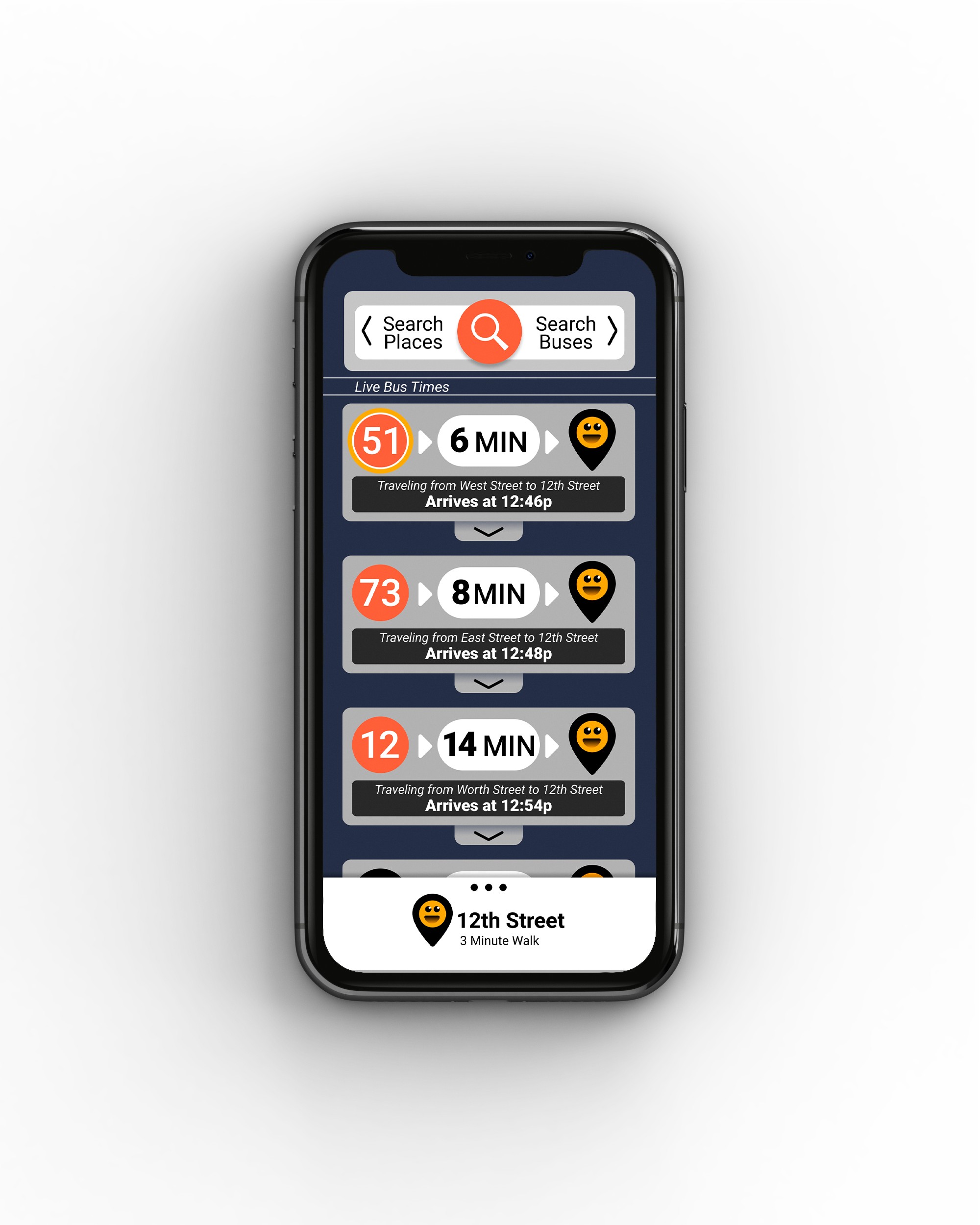
The LMTA is a growing service with more buses, more rides to offer, and many new riders to serve. This app was created as a way to address the growing pains of scaling a necessary city infrastructure.
Role
I was the lead Product Designer for this project and consulted with a mentor to gain valuable insight as I progressed. I ran preliminary research to develop proto-personas, created key user stories, and built a lo-fi prototype to test the usability of the app before creating a full visual language for final hi-fi mock ups.
Problem
New bus lines means there are more rides than ever before! But riders have more to keep track of now, and with the changes there is a wave of existing riders who need to learn the new schedules and times. The added complexity means that there is more opportunity for confusion and for riders to get on the wrong bus.
User Research
Survey Demographics
Ages
- 15/28 Riders were in their 20s
- 4/28 Riders were in their 30s
- 2/28 Riders were between 10-20
- 2/28 Riders were in their 40s
- 5/28 Riders were 50+
Occupations
- 9/28 Riders were students
- 8/28 Riders were parents/caretakers
- 11/28 Riders had various unique occupations
Bus Riding Behavior
Reasons to Ride
- 17/28 Riders rode for leisure
- 9/28 Riders rode for school
- 6/28 Riders rode to work
- 2/28 Riders rode for running errands
- 1/28 Riders rode when their personal vehicle broke down
Frequency of Riding
- 12/28 Riders rode less than 1 time/week
- 8/28 Riders rode 1-5 times/week
- 8/28 Riders rode 6+ times/week
Pain Points
General Pain Points:
- 20/28 Riders had experienced arriving at their stop late
- 12/28 Riders missed their bus due to a schedule change
- 1/28 Riders got on the wrong bus
- 1/28 riders missed their bus because of line changes
Trip Complexity
- 18/28 had only one bus per trip
- 6/28 had two buses per trip
- 4/28 had more than two buses in a single trip
Travel Time
- 21 Riders had a bus stop within a 10 minute walk
- 7 Riders had a stop within a minute
Rider Quotes
“I watched my bus pull away because I didn’t know it was my bus until too late.”
Rider Rusty M.
“If I get to a bus stop and see no bus I can’t tell if my bus has already left or if it’s running late.”
Rider Addyson B.
Proto Personas
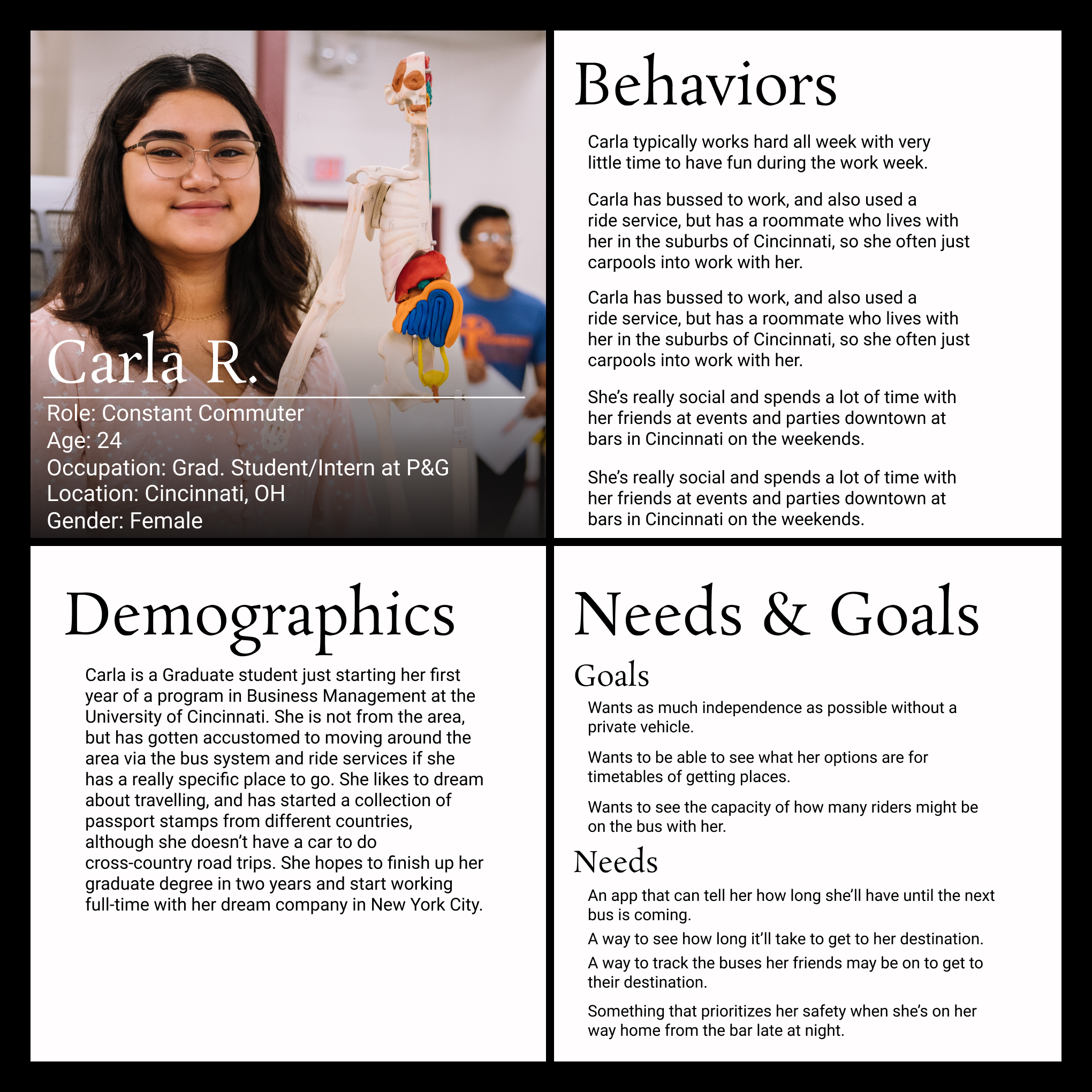
Carla R. “Constant Commuter”
- Graduate Student
- Does not own a car, relies on the bus to travel
- Rides the bus almost daily
- Has a regular bus she rides
- Doesn’t want to wade through too many bus options to find “her bus”
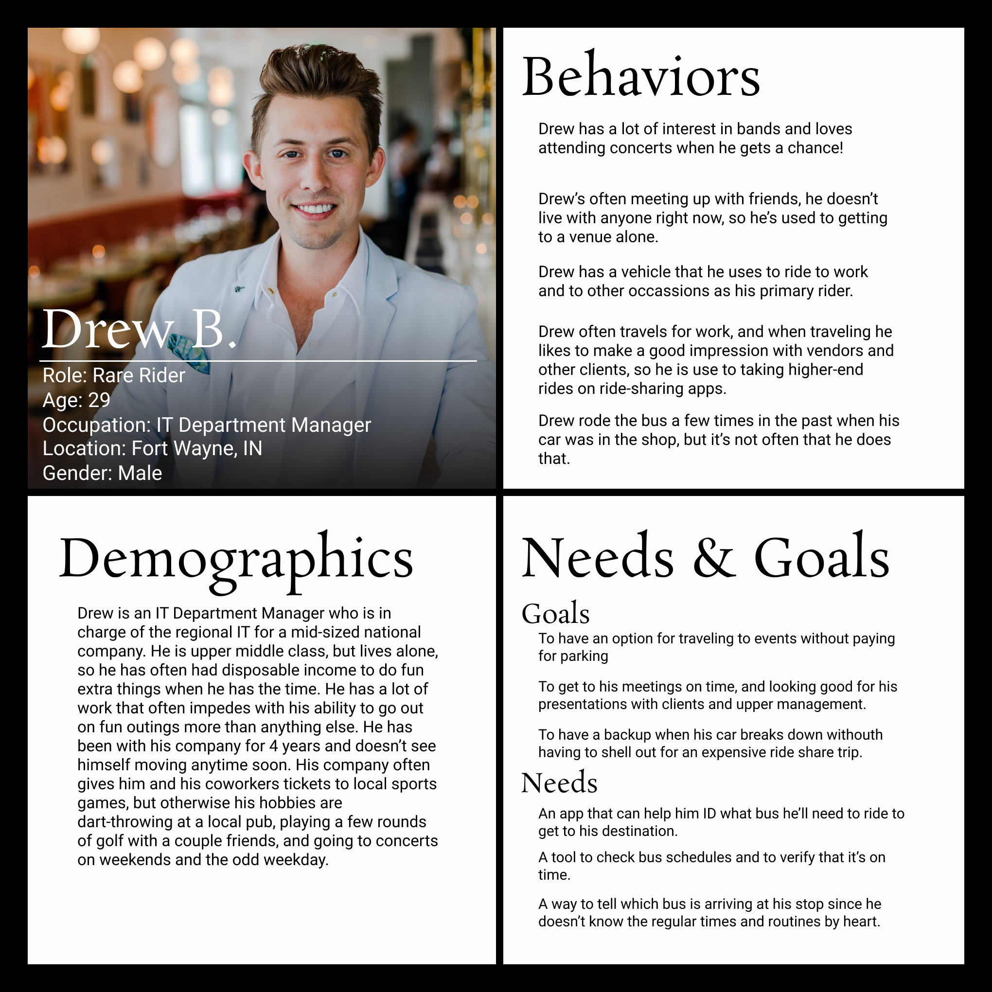
Drew B. “Rare Rider”
- IT Worker
- Has a car, does not regularly rely on public transportation
- Does not know much about the bus system
- Wants to ride the bus to avoid paying for parking when going to events
Competitive Analysis
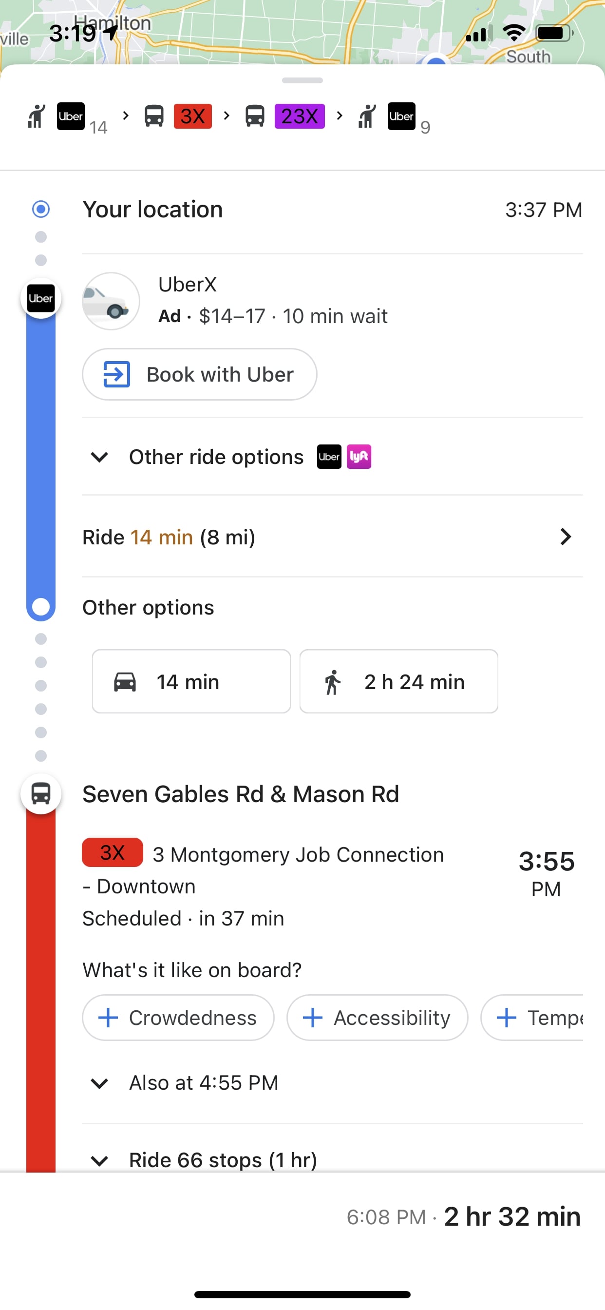
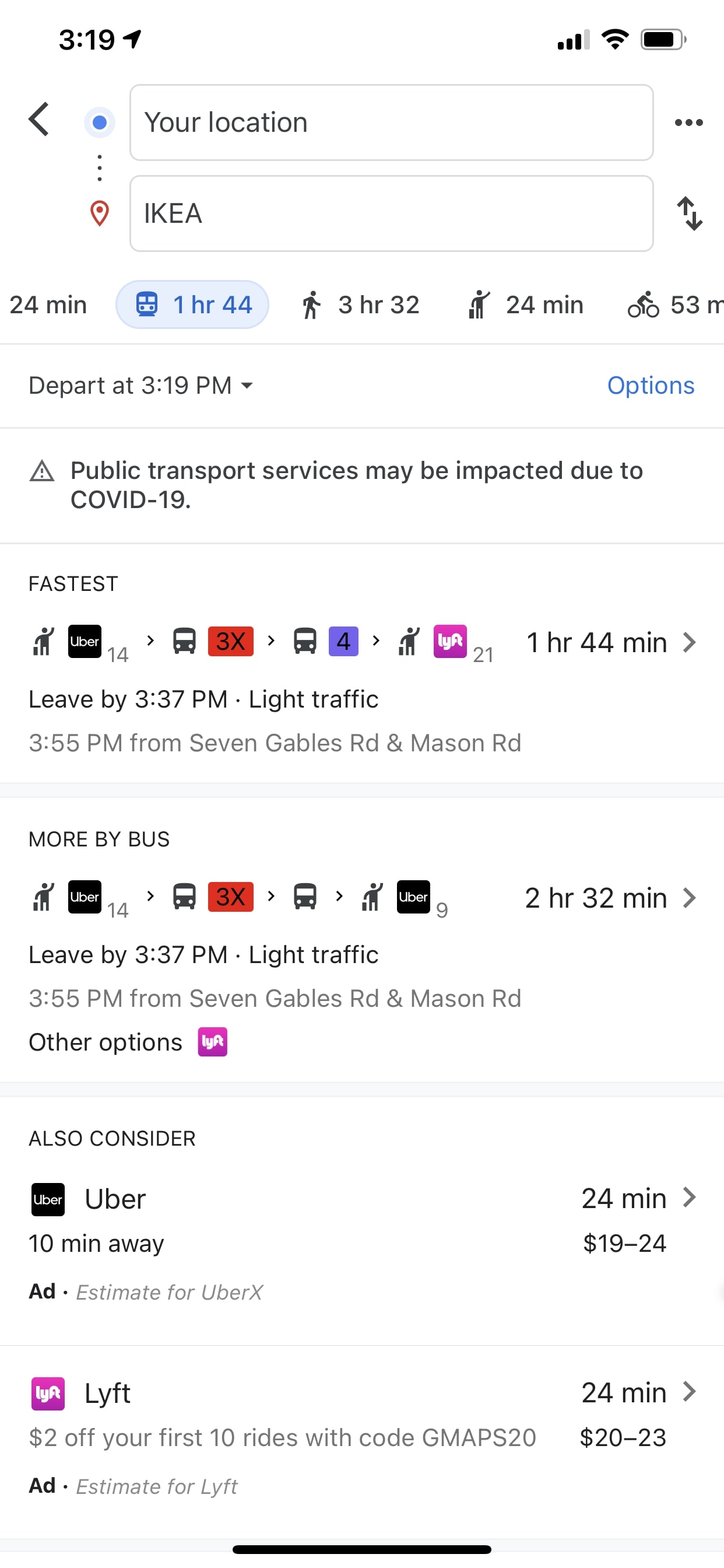
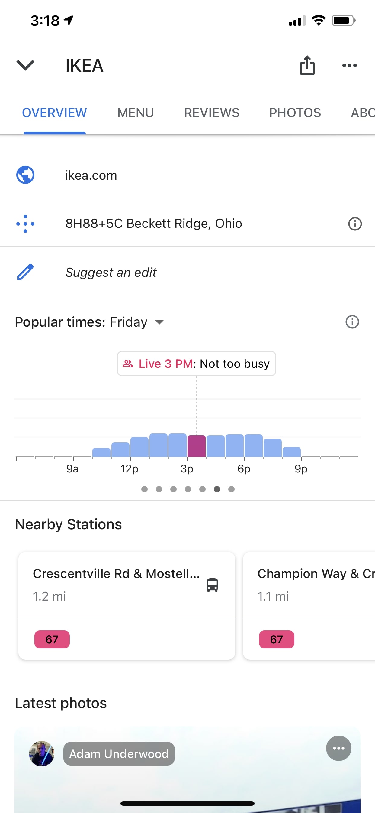
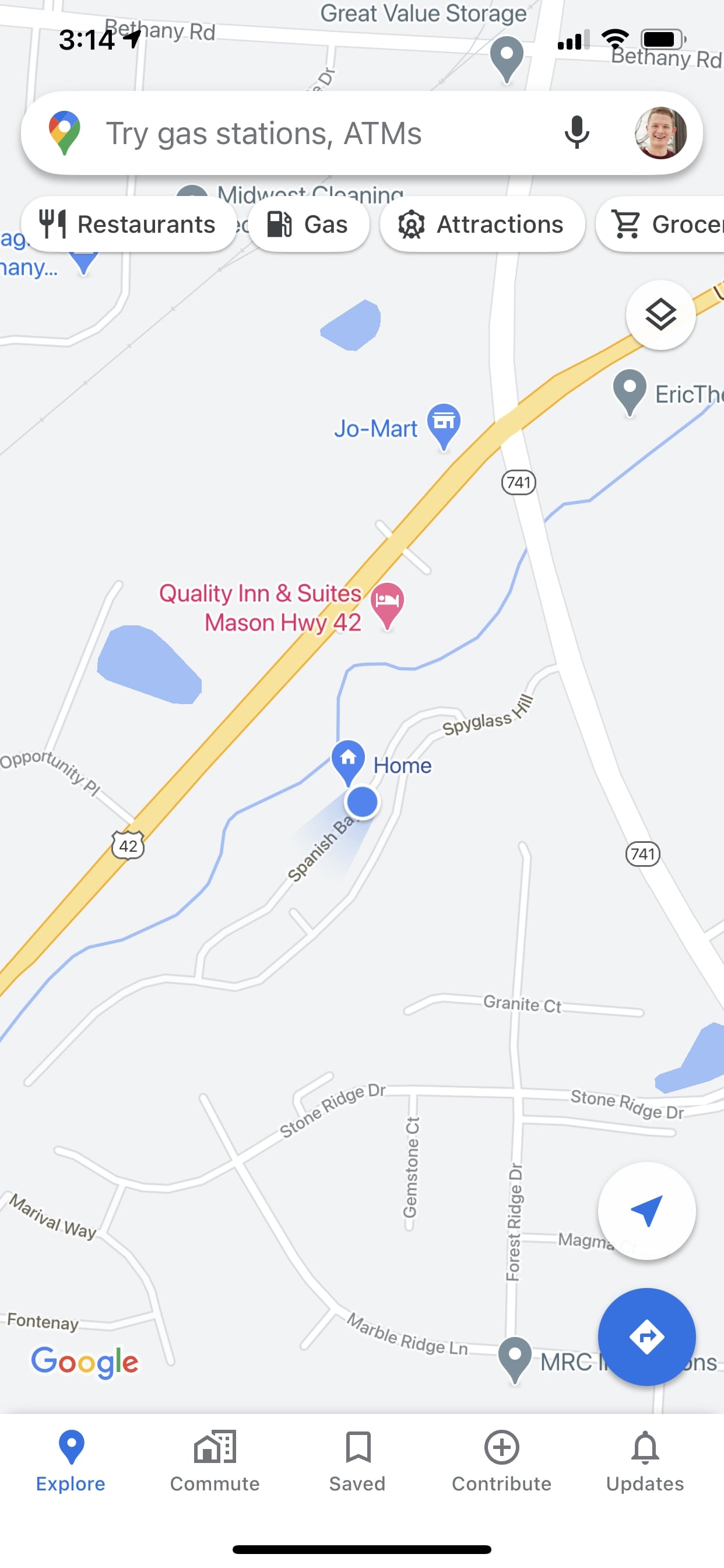
Google Maps
- Common for most to have installed
- Tools for public transportation are not emphasized and take searching
- Arrival times and schedules are spread out and confusing
- Includes options like private transport and ridesharing apps
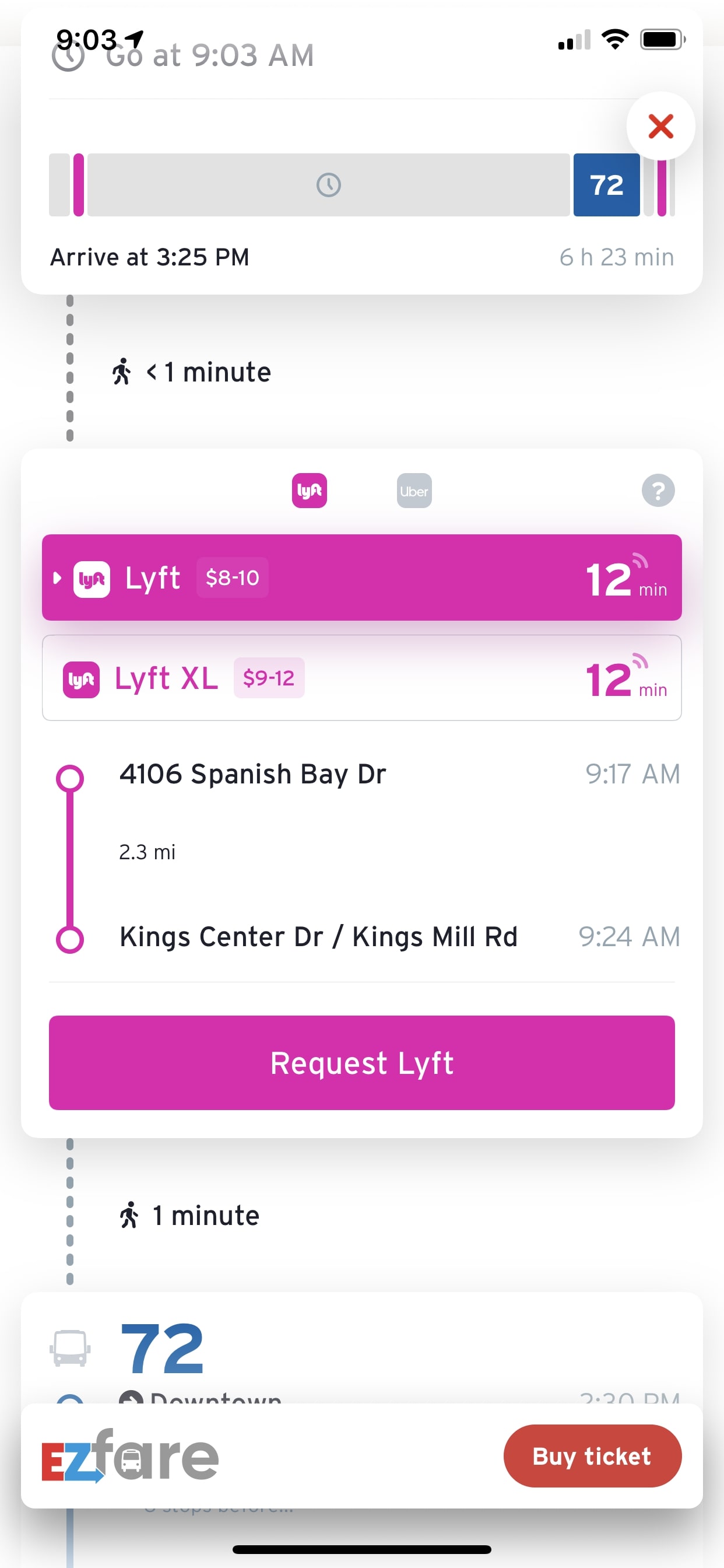
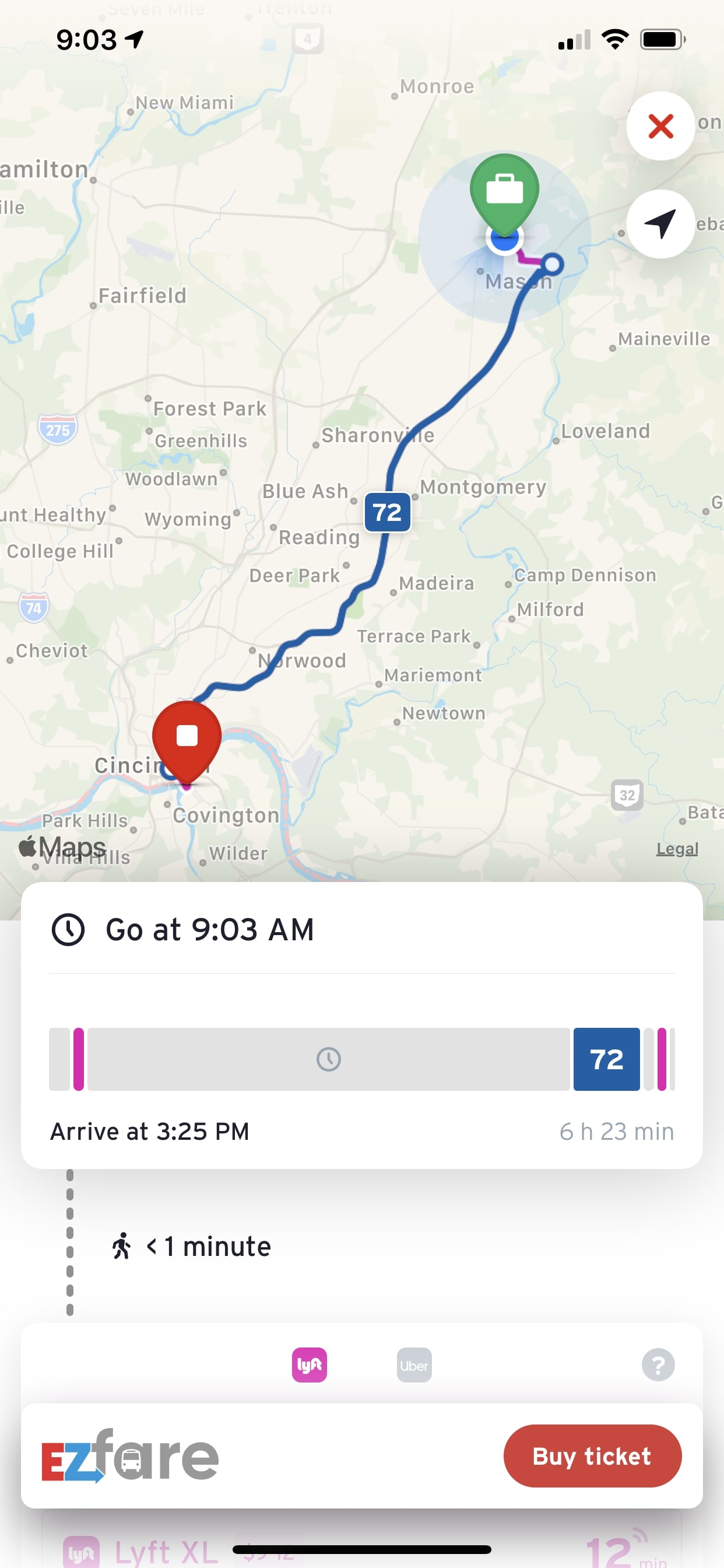
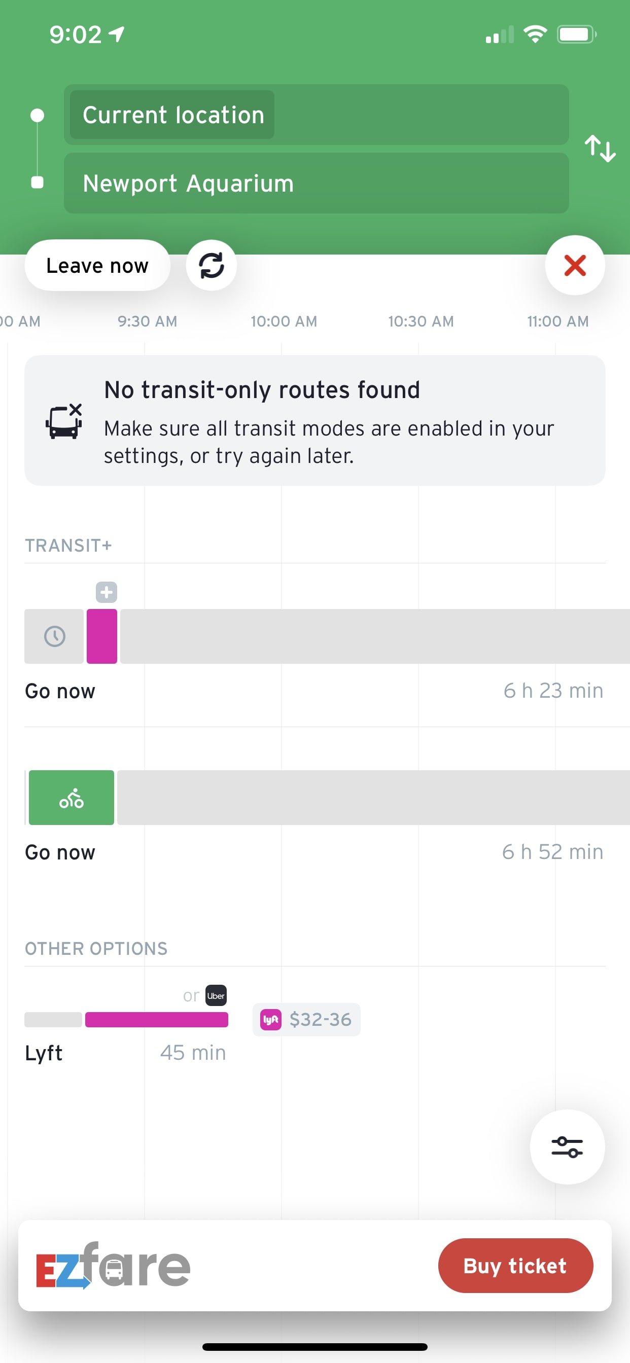
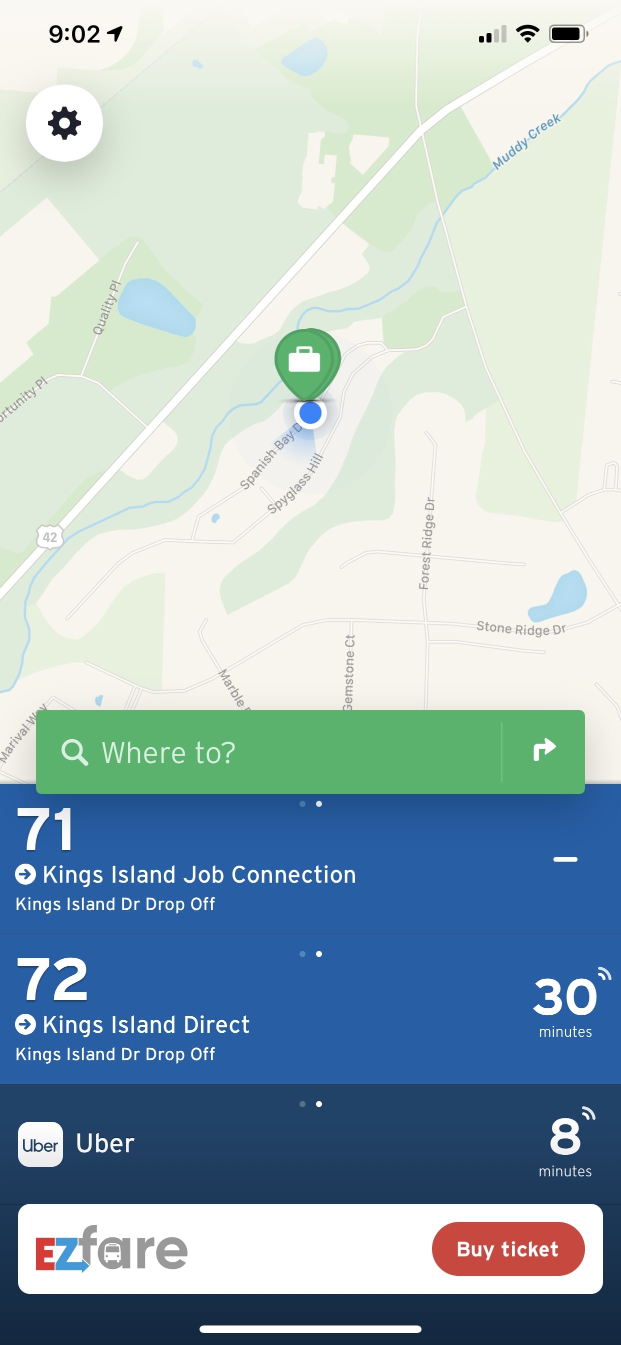
General Transit App (EZ Fare)
- Broad app for general use anywhere
- Split between public transportation and uses like ridesharing apps
- Linear travel schedules are easy to use and follow
- Focus on maps and the visual space of how to navigate
- Purchasing tickets rolled into one app
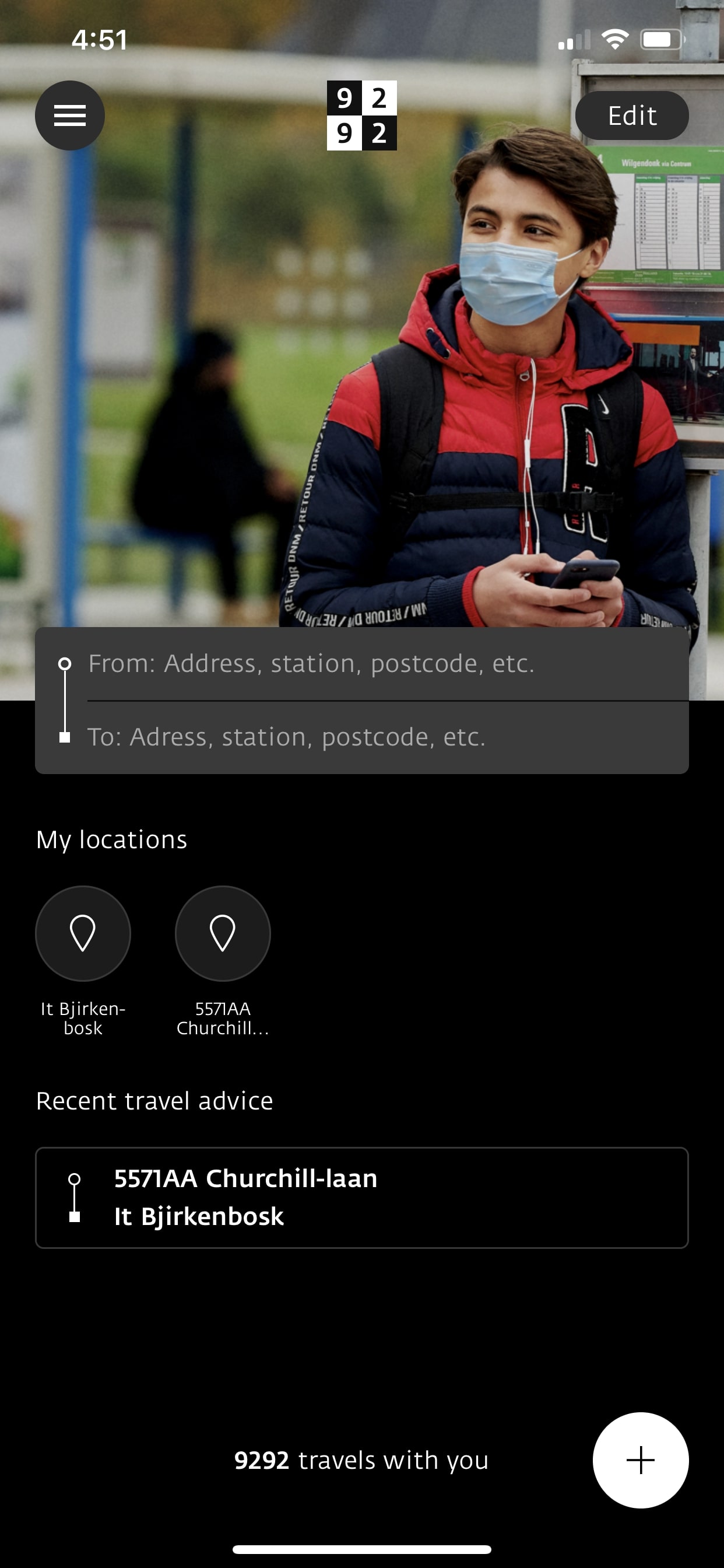
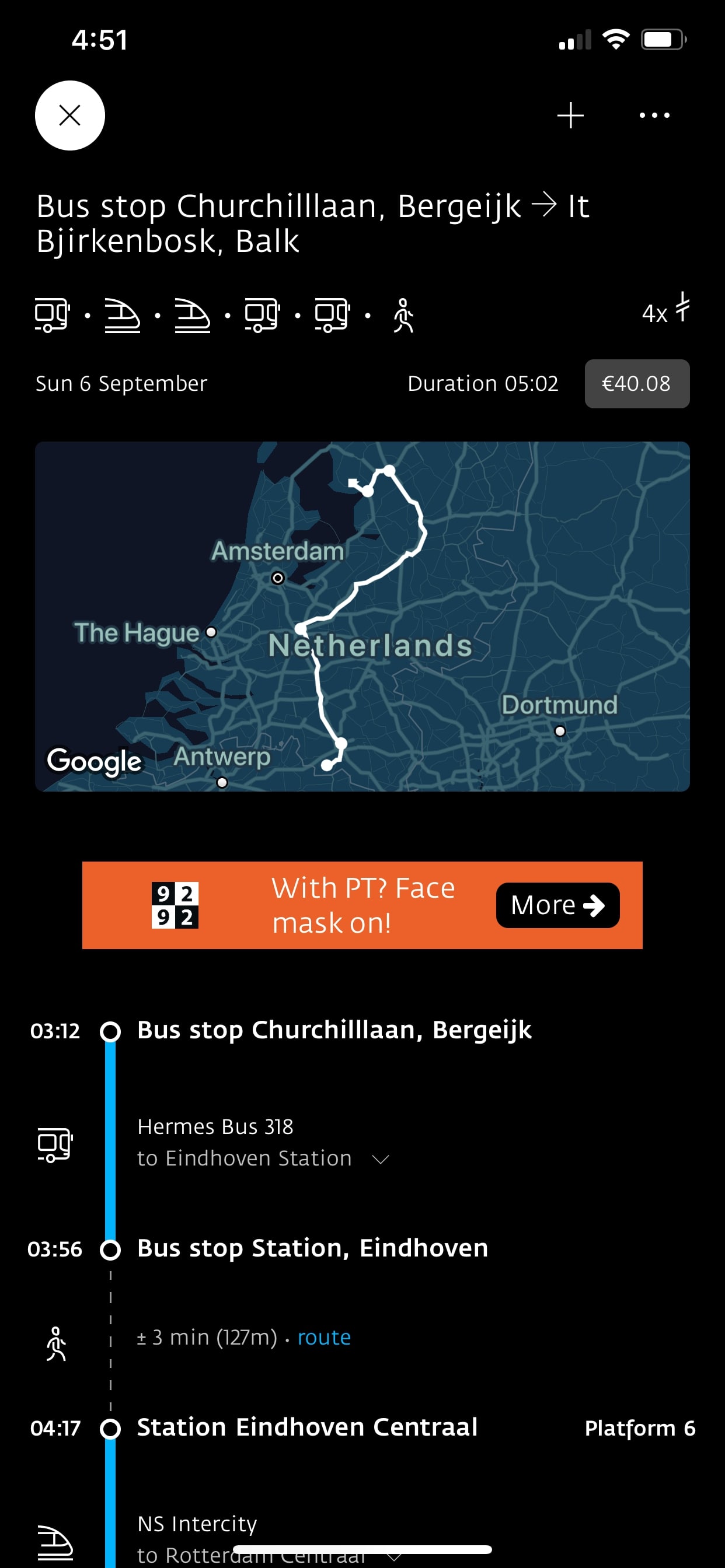
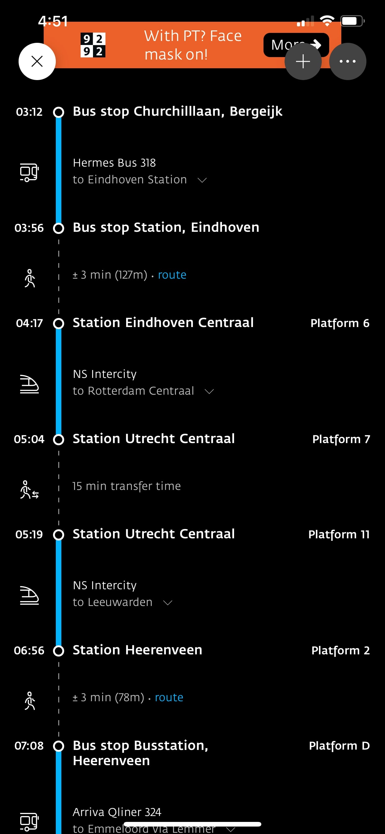
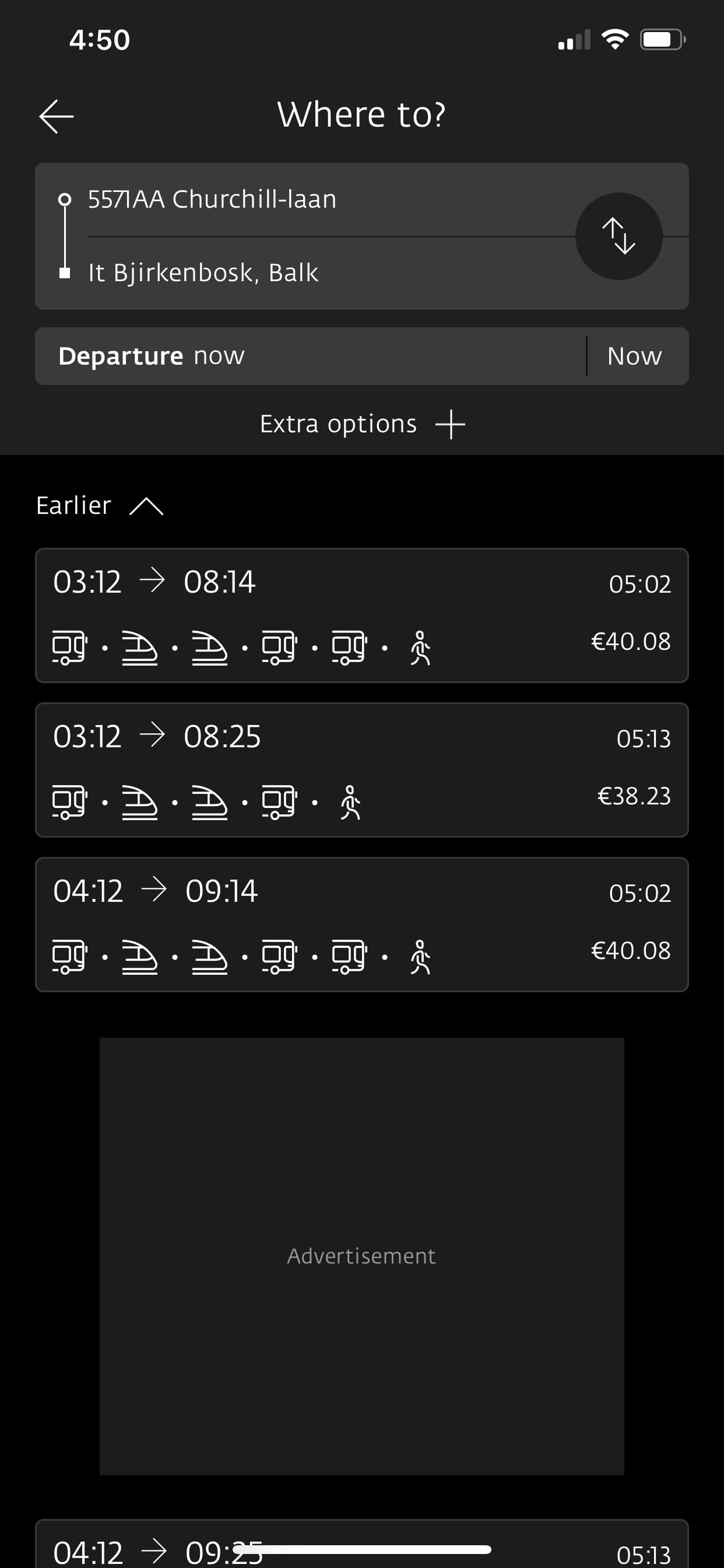
Local Transit App (Netherlands Bus Line)
- Very specific to the city or region
- Split between public transport with options for trains or buses
- Linear travel schedules are easy to use and follow, but present many details
- Split between a map focus for specific trips, and a linear step by step guide
Product Prioritization
Constant Commuter Goals
- As a daily rider, I want to check my bus arrival time so that I can make sure I’m ready on time.
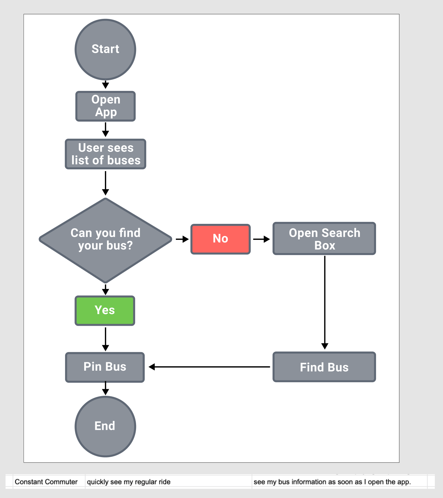
- As a constant commuter, I want to save my regular ride so that I can see my bus information as soon as I open the app.
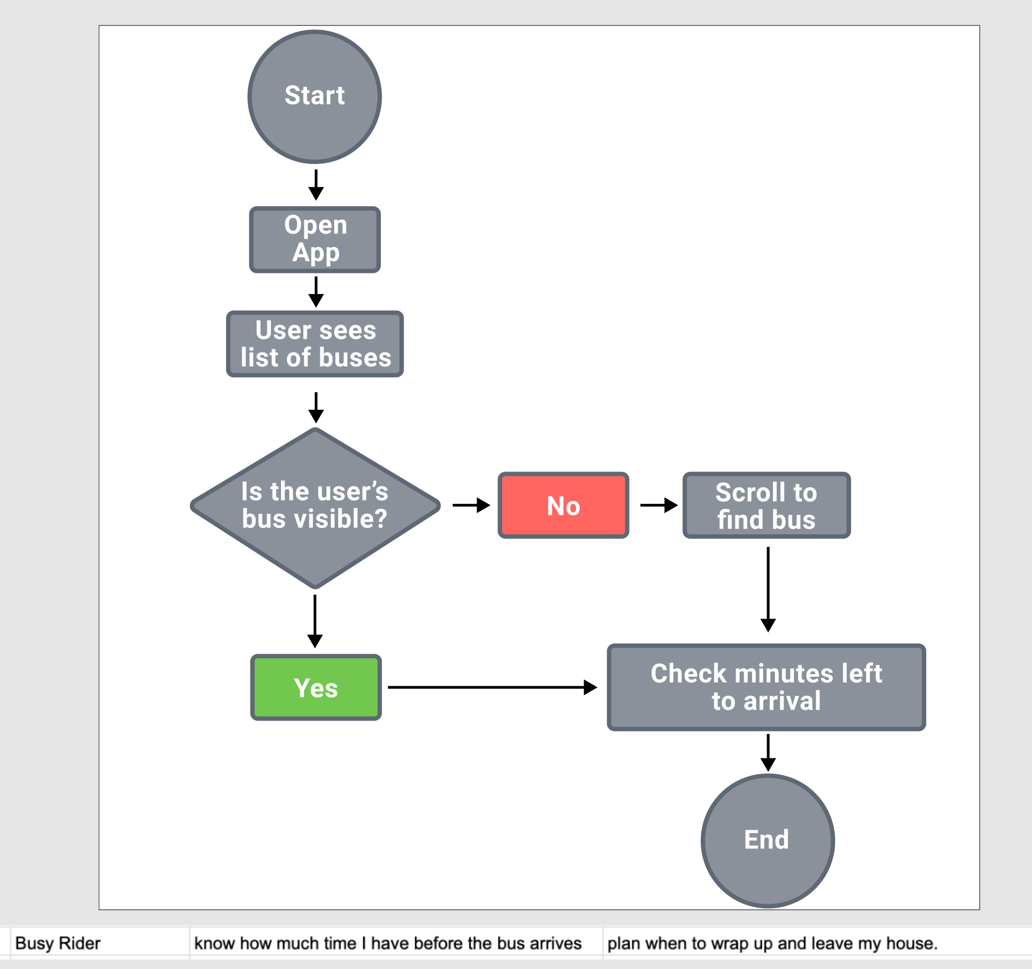
- As a busy rider, I want to know how much time I have before the bus arrives so that I can plan when to wrap up and leave my house.
Rare Rider Goals
- As a first time rider, I want to know what stop is closest to me so that I can have a starting point for my trip.
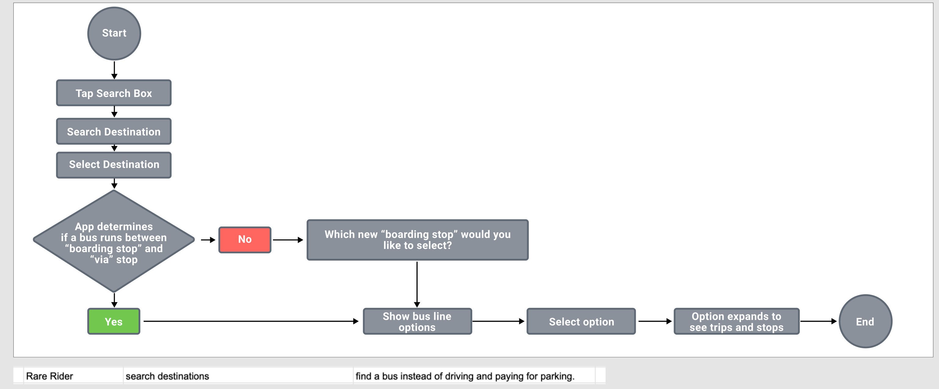
- As a rare rider, I want to search destinations so that I can find a bus instead of driving and paying for parking.
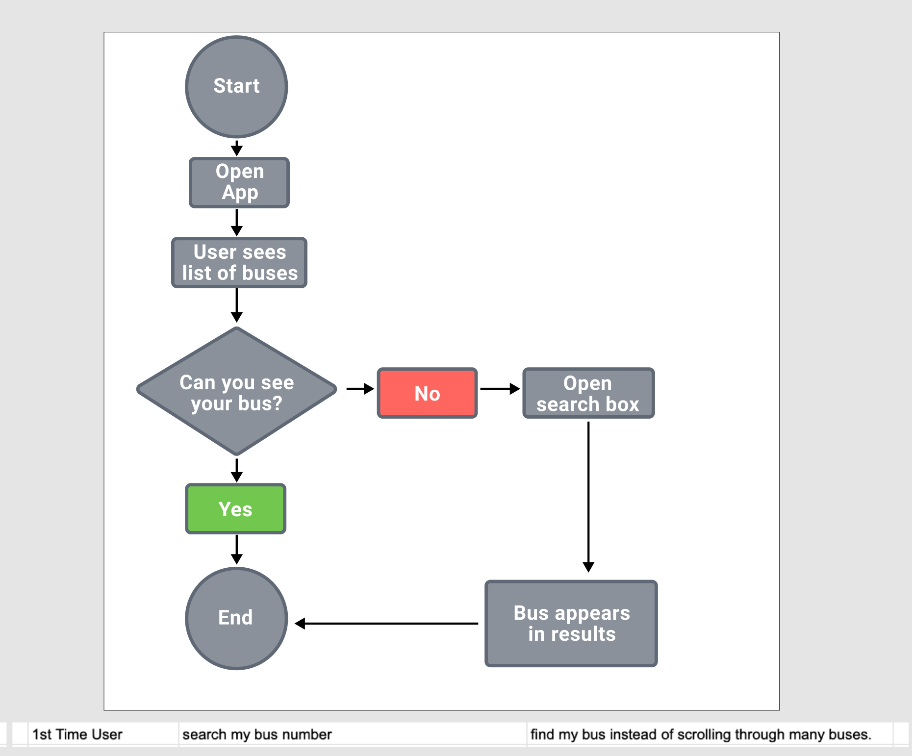
- As a first time user, I want to search for a bus number so that I can find a specific bus instead of scrolling through many buses.
Prioritized Goals
User stories were written and refined based on the interview findings, and multiple jobs to be done written and prioritized. The top 4 were:
- I want to tell what time my bus will arrive
- I want to tell how long I have to get to the bus stop
- I want to see which bus is my bus
- I want to add my destination
The corresponding stories were then mapped into flow charts.
Wireframe and Testing
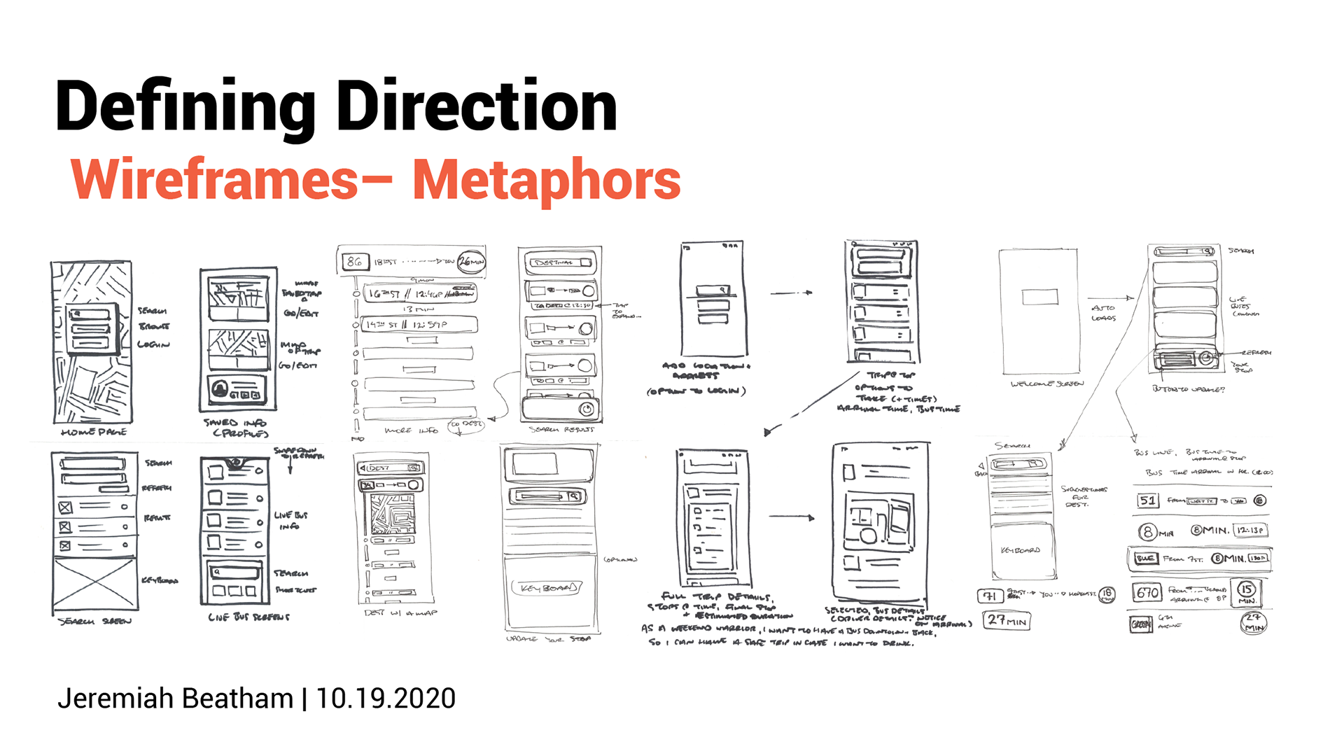
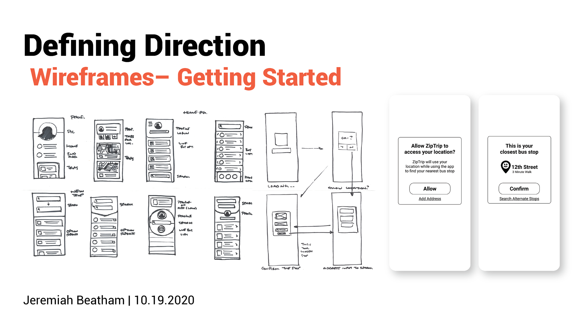
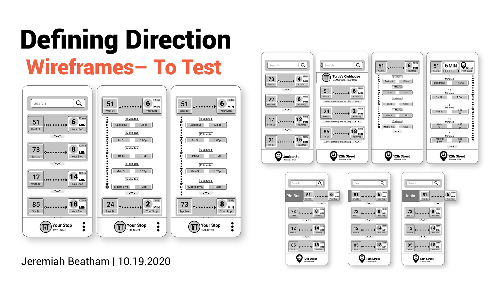
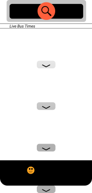
I created a series of sketches to refine concepts and layout and flows as they would appear on a smart phone, thinking mobile-first. These then were turned into lo-fidelity wireframes for prototyping and testing.
Test Planning
I took my key goals and translated them into a few tests to understand the effectiveness for my target users groups. I wanted to position the tests to cover the key goals for users who were used to riding often, and users who were brand new to the metro transit system. I started the tasks with more “Rare Rider” goals and then moved to “Constant Commuter” goals to capture the deepening understanding of longer-term users.
Tasks Tested
Signing Up
Rare Riders will need to know how to sign up without any background info on the app or system. I wanted to understand if they understood how to accomplish this easily.
Signing Up Conservatively
Rare Riders may be uncomfortable with the permissions needed to begin, and I wanted to understand if they would be able to understand the offerings without asking for their privacy first.
Browsing Buses
Constant commuters need to easily distinguish which route was “theirs” in a sea of important information. I wanted to understand whether the hierarchy of the interface was serving the needs of the users.
Checking Arrival Times
Constant commuters need to easily see and understand what the arrival times and windows looked like at a glance, I once again was looking to gather information on how well these numbers were translating.
Searching for Routes
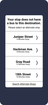
Both a Constant Commuters or Rare Riders may be using a new bus line, I wanted to understand if users understood the mental model and shift between bus lines that may be new to them, based on a new destination.
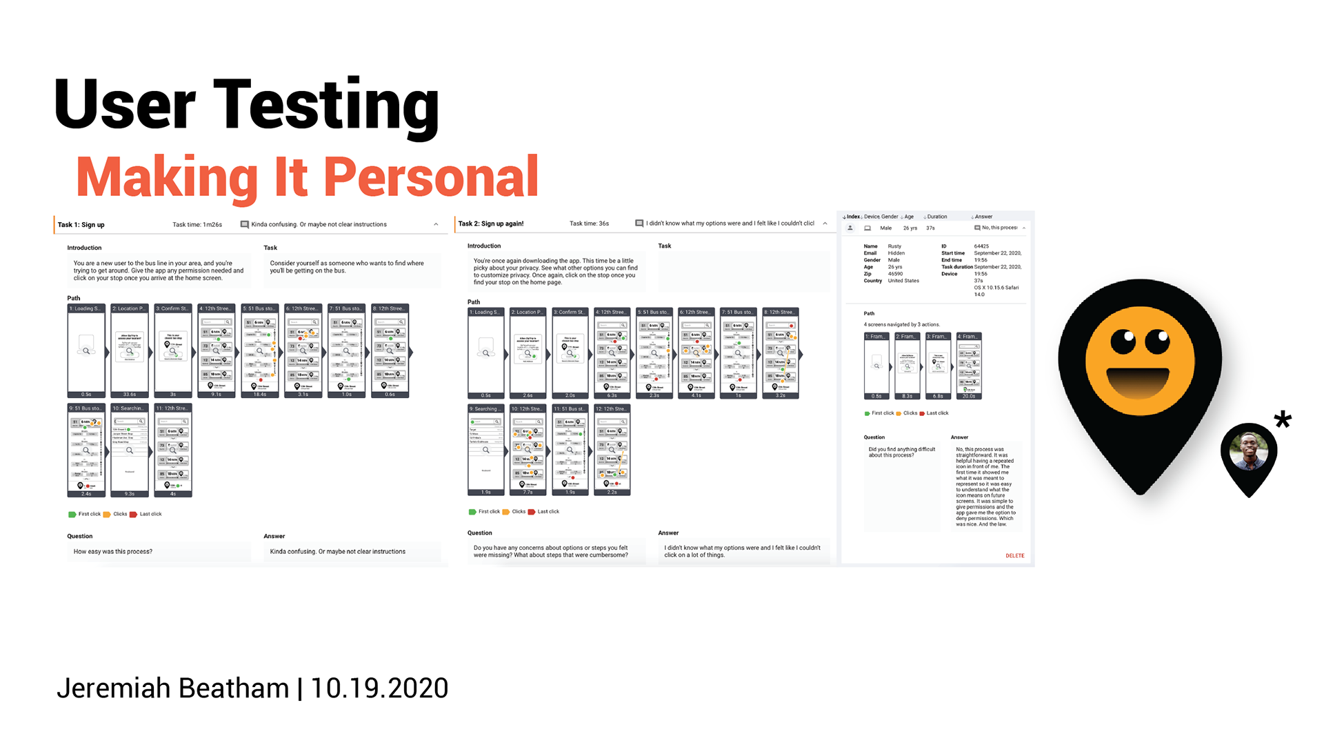
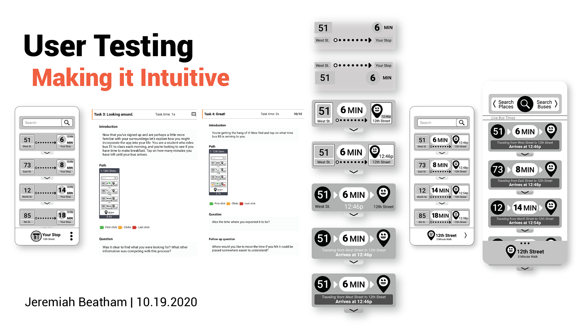
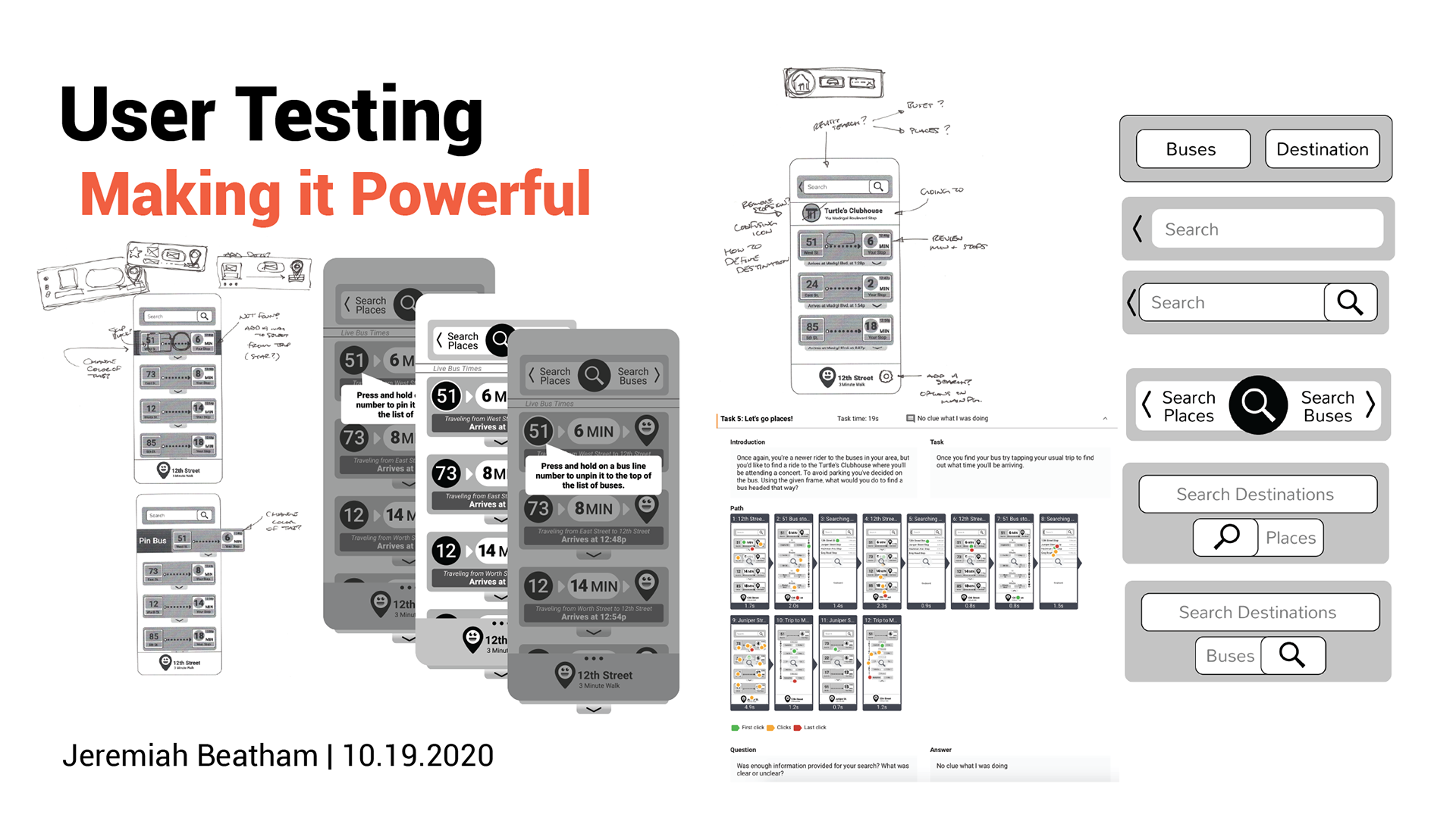
This is an output of the test findings. Users struggled with the fidelity of the prototype, but I was able to gain some great insights even from these tests.
Usability Testing Outcomes
The results were in and there was a lot of work to be done. I pivoted 3 key areas to meet the gaps that were identified by users before making some more higher fidelity mockups for handoff.
Labeling Key Information
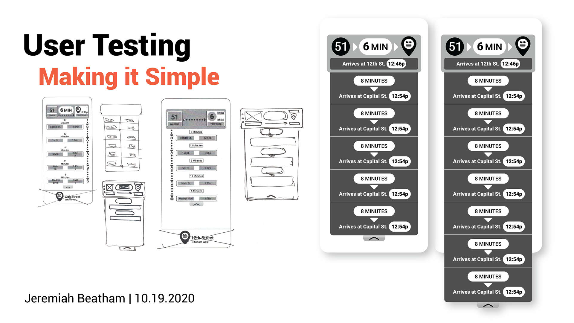
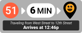
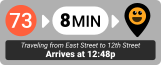
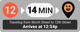
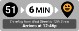
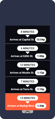
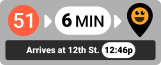
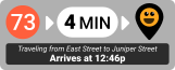
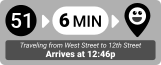
Test outcomes underlined that there were simply too many numbers and things to look at, especially for a Rare Rider. This helpful reality check pushed me to include arrival times in simple language, and move from a core focus on the countdown time to instead focus on when the bus would arrive to a specific stop.
Giving Light Guidance
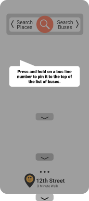
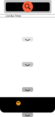
Looking at a matrix of multiple buses and being bombarded with schedules clearly made learning the interface tricky– probably even moreso when Zip Trip goes live as numbers or landmarks may change as bus times and proximities change. Ia
Trip Overviews
I thought originally this might be a fast follow to the MVP, but it was clearer that users felt like they needed to understand their options and the stops and times along a trip’s route even if they had already selected a final destination. I created a simpler, bolder version of the trip to follow the changes I had made with the arrival times, and to learn my lesson from the lack of labels.
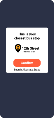
Zipping Up for Handoff
With my test insights and areas of opportunity addressed I addressed the fidelity and prepared to share the final concept with stakeholders.





Next Steps
- Rerun testing with the new changes to understand what impact those updates had on the success of the tasks
- Partnering with LMTA on future updates to enhance bus notifications, personalized accounts for riders, and sharing of schedules
- Pursuing sponsor deals within the city to advertise for upcoming events and support this key city infrastructure
- Broaden the persona scope and define other user types
- More interviews and research to understand other core needs like notice of capacity, or bus fares that vary per trip.
My Key Takeaways
Looking at a matrix of multiple buses and being bombarded with schedules clearly made learning the interface tricky– probably even moreso when Zip Trip goes live as numbers or landmarks may change as bus times and proximities change. Ia

ZipTrip Metro Transit App

Overview

The LMTA is a growing service with more buses, more rides to offer, and many new riders to serve. This app was created as a way to address the growing pains of scaling a necessary city infrastructure.
Role
I was the lead Product Designer for this project and consulted with a mentor to gain valuable insight as I progressed. I ran preliminary research to develop proto-personas, created key user stories, and built a lo-fi prototype to test the usability of the app before creating a full visual language for final hi-fi mock ups.
Problem
New bus lines means there are more rides than ever before! But riders have more to keep track of now, and with the changes there is a wave of existing riders who need to learn the new schedules and times. The added complexity means that there is more opportunity for confusion and for riders to get on the wrong bus.
User Research
Survey Demographics

Ages
- 15/28 Riders were in their 20s
- 4/28 Riders were in their 30s
- 2/28 Riders were between 10-20
- 2/28 Riders were in their 40s
- 5/28 Riders were 50+
Occupations
- 9/28 Riders were students
- 8/28 Riders were parents/caretakers
- 11/28 Riders had various unique occupations
Bus Riding Behavior
Reasons to Ride
- 17/28 Riders rode for leisure
- 9/28 Riders rode for school
- 6/28 Riders rode to work
- 2/28 Riders rode for running errands
- 1/28 Riders rode when their personal vehicle broke down
Frequency of Riding
- 12/28 Riders rode less than 1 time/week
- 8/28 Riders rode 1-5 times/week
- 8/28 Riders rode 6+ times/week
Pain Points
General Pain Points:
- 20/28 Riders had experienced arriving at their stop late
- 12/28 Riders missed their bus due to a schedule change
- 1/28 Riders got on the wrong bus
- 1/28 riders missed their bus because of line changes
Trip Complexity
- 18/28 had only one bus per trip
- 6/28 had two buses per trip
- 4/28 had more than two buses in a single trip
Travel Time
- 7 Riders had a stop within a 1 minute walk
- 21 Riders had a bus stop within a 2-10 minute walk
Rider Quotes
“I watched my bus pull away because I didn’t know it was my bus until too late.”
Rider Rusty M.
“If I get to a bus stop and see no bus I can’t tell if my bus has already left or if it’s running late.”
Rider Addyson B.
Proto Personas
Carla R. “Constant Commuter”
- Graduate Student
- Does not own a car, relies on the bus to travel
- Rides the bus almost daily
- Has a regular bus she rides
- Doesn’t want to wade through too many bus options to find “her bus”
Drew B. “Rare Rider”
- IT Worker
- Has a car, does not regularly rely on public transportation
- Does not know much about the bus system
- Wants to ride the bus to avoid paying for parking when going to events
Competitive Analysis
Google Maps
- Common for most to have installed
- Tools for public transportation are not emphasized and take searching
- Arrival times and schedules are spread out and confusing
- Includes options like private transport and ridesharing apps
General Transit App (EZ Fare)
- Broad app for general use anywhere
- Split between public transportation and uses like ridesharing apps
- Linear travel schedules are easy to use and follow
- Focus on maps and the visual space of how to navigate
- Purchasing tickets rolled into one app
Local Transit App (Netherlands Bus Line)
- Very specific to the city or region
- Split between public transport with options for trains or buses
- Linear travel schedules are easy to use and follow, but present many details
- Split between a map focus for specific trips, and a linear step by step guide
Product Prioritization
Constant Commuter Goals
- As a daily rider, I want to check my bus arrival time so that I can make sure I’m ready on time.
- As a constant commuter, I want to save my regular ride so that I can see my bus information as soon as I open the app.
- As a busy rider, I want to know how much time I have before the bus arrives so that I can plan when to wrap up and leave my house.
Rare Rider Goals
- As a first time rider, I want to know what stop is closest to me so that I can have a starting point for my trip.
- As a rare rider, I want to search destinations so that I can find a bus instead of driving and paying for parking.
- As a first time user, I want to search for a bus number so that I can find a specific bus instead of scrolling through many buses.
Prioritized Goals
User stories were written and refined based on the interview findings, and multiple jobs to be done written and prioritized. The top 4 were:
- I want to tell what time my bus will arrive
- I want to tell how long I have to get to the bus stop
- I want to see which bus is my bus
- I want to add my destination
The corresponding stories were then mapped into flow charts.
Wireframe and Testing
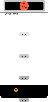
I created a series of sketches to refine concepts and layout and flows as they would appear on a smart phone, thinking mobile-first. These then were turned into lo-fidelity wireframes for prototyping and testing.
Test Planning

I took my key goals and translated them into a few tests to understand the effectiveness for my target users groups. I wanted to position the tests to cover the key goals for users who were used to riding often, and users who were brand new to the metro transit system. I started the tasks with more “Rare Rider” goals and then moved to “Constant Commuter” goals to capture the deepening understanding of longer-term users.
Tasks Tested

Signing Up
Rare Riders will need to know how to sign up without any background info on the app or system. I wanted to understand if they understood how to accomplish this easily.
Checking Arrival Times
Constant commuters need to easily see and understand what the arrival times and windows looked like at a glance, I once again was looking to gather information on how well these numbers were translating.
Searching for Routes
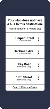
Both a Constant Commuters or Rare Riders may be using a new bus line, I wanted to understand if users understood the mental model and shift between bus lines that may be new to them, based on a new destination.
Signing Up Conservatively
Rare Riders may be uncomfortable with the permissions needed to begin, and I wanted to understand if they would be able to understand the offerings without asking for their privacy first.
Browsing Buses
Constant commuters need to easily distinguish which route was “theirs” in a sea of important information. I wanted to understand whether the hierarchy of the interface was serving the needs of the users.
This is an output of the test findings. Users struggled with the fidelity of the prototype, but I was able to gain some great insights even from these tests.
Usability Testing Outcomes
The results were in and there was a lot of work to be done. I pivoted 3 key areas to meet the gaps that were identified by users before making some more higher fidelity mockups for handoff.
Labeling Key Information

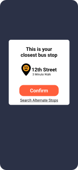
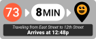
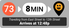
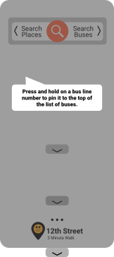
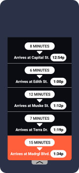
Test outcomes underlined that there were simply too many numbers and things to look at, especially for a Rare Rider. This helpful reality check pushed me to include arrival times in simple language, and move from a core focus on the countdown time to instead focus on when the bus would arrive to a specific stop.
Giving Light Guidance
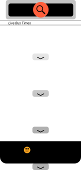
Looking at a matrix of multiple buses and being bombarded with schedules clearly made learning the interface tricky– probably even more-so when Zip Trip goes live and numbers or landmarks change along with bus proximity, time of day, etc. I created a few helpful tool tip interactions to allow users to get some input if they were on a screen without taking any action for a delayed period.
Trip Overviews
I thought originally this might be a fast follow to the MVP, but it was clearer that users felt like they needed to understand their options and the stops and times along a trip’s route even if they had already selected a final destination. I created a simpler, bolder version of the trip to follow the changes I had made with the arrival times, and to learn my lesson from the lack of labels.
Zipping Up for Handoff
With my test insights and areas of opportunity addressed I addressed the fidelity and prepared to share the final concept with stakeholders.














Next Steps

- Rerun testing with the new changes to understand what impact those updates had on the success of the tasks
- Partnering with LMTA on future updates to enhance bus notifications, personalized accounts for riders, and sharing of schedules
- Pursuing sponsor deals within the city to advertise for upcoming events and support this key city infrastructure
- Broaden the persona scope and define other user types
- More interviews and research to understand other core needs like notice of capacity, or bus fares that vary per trip.
My Key Takeaways
- Learning is a lot easier to digest and react to when working in lower fidelity
- Keeping things at too low of a fidelity makes the tests feel a little chaotic and not as representative of a final product
- User personas are core to any good exploration as they give a concrete goal to your pursuit