ITAMIX Digital Library

Overview
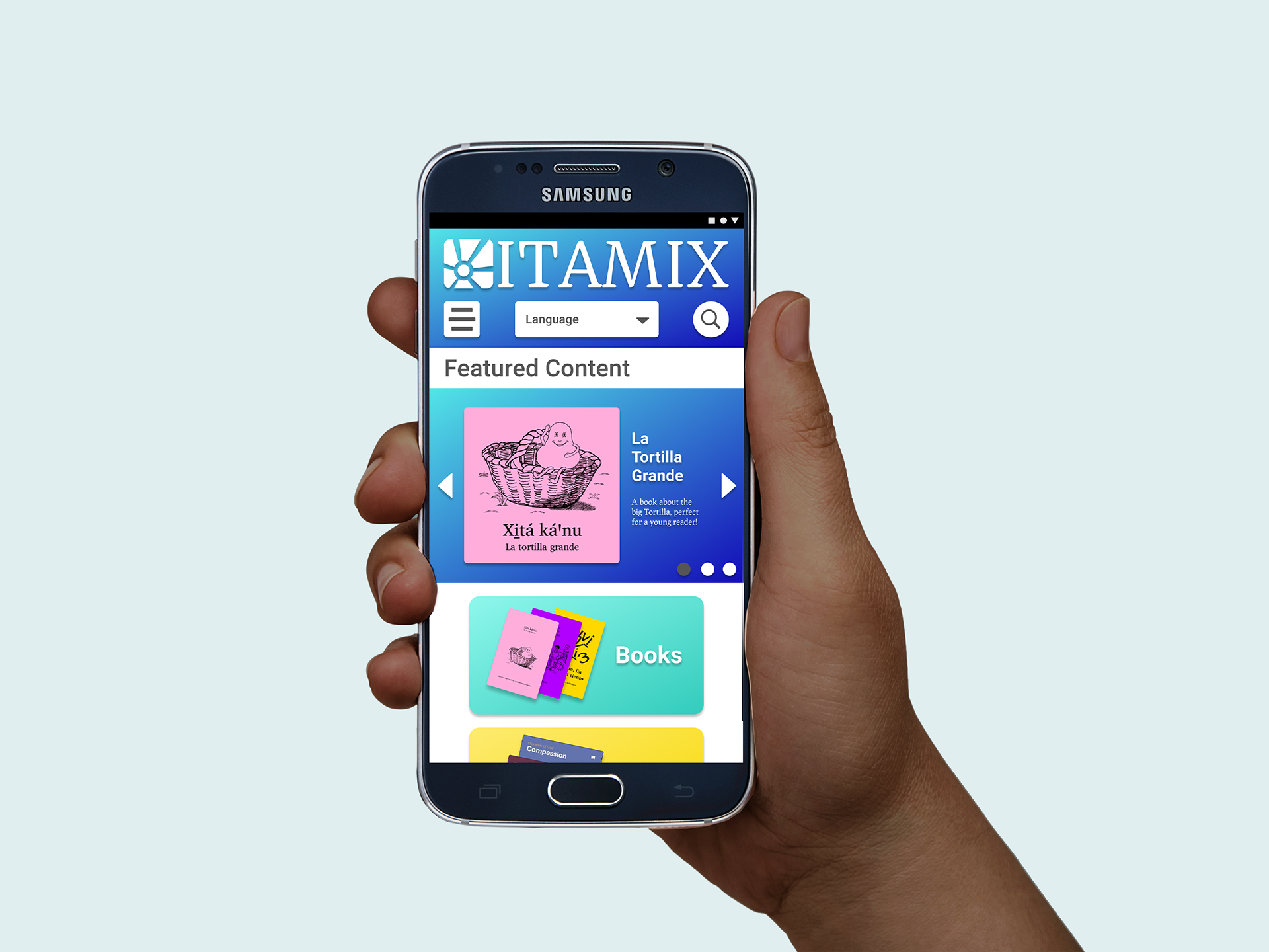
A mobile-first library system putting native-language reading materials in the palms of Mixtec speakers.
Role
I was the sole UX/UI Designer, I worked with the client to gather research data, worked with mentorship to get outside opinions and feedback, and then extracted pain points, insights, priorities that all fed the ideation and the first MVP leading on to usability testing, which I then conducted and analyzed to plan next steps. Branding and visual language was established in conjunction with client inspiration.
Problem
Linguists in the Southern Oaxaca area are preserving the Mixtec language and culture through literacy work, but there is no digital tool for Mixtec Speakers to access the materials that have been created.
Audience
The small Southern Villages of Coicoyán and San Martín Peras, limited to the few Western Juxtlahuaca Mixtec-speaking villages.
Solution
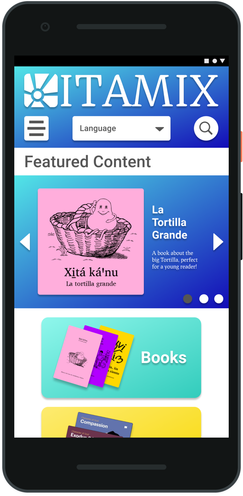
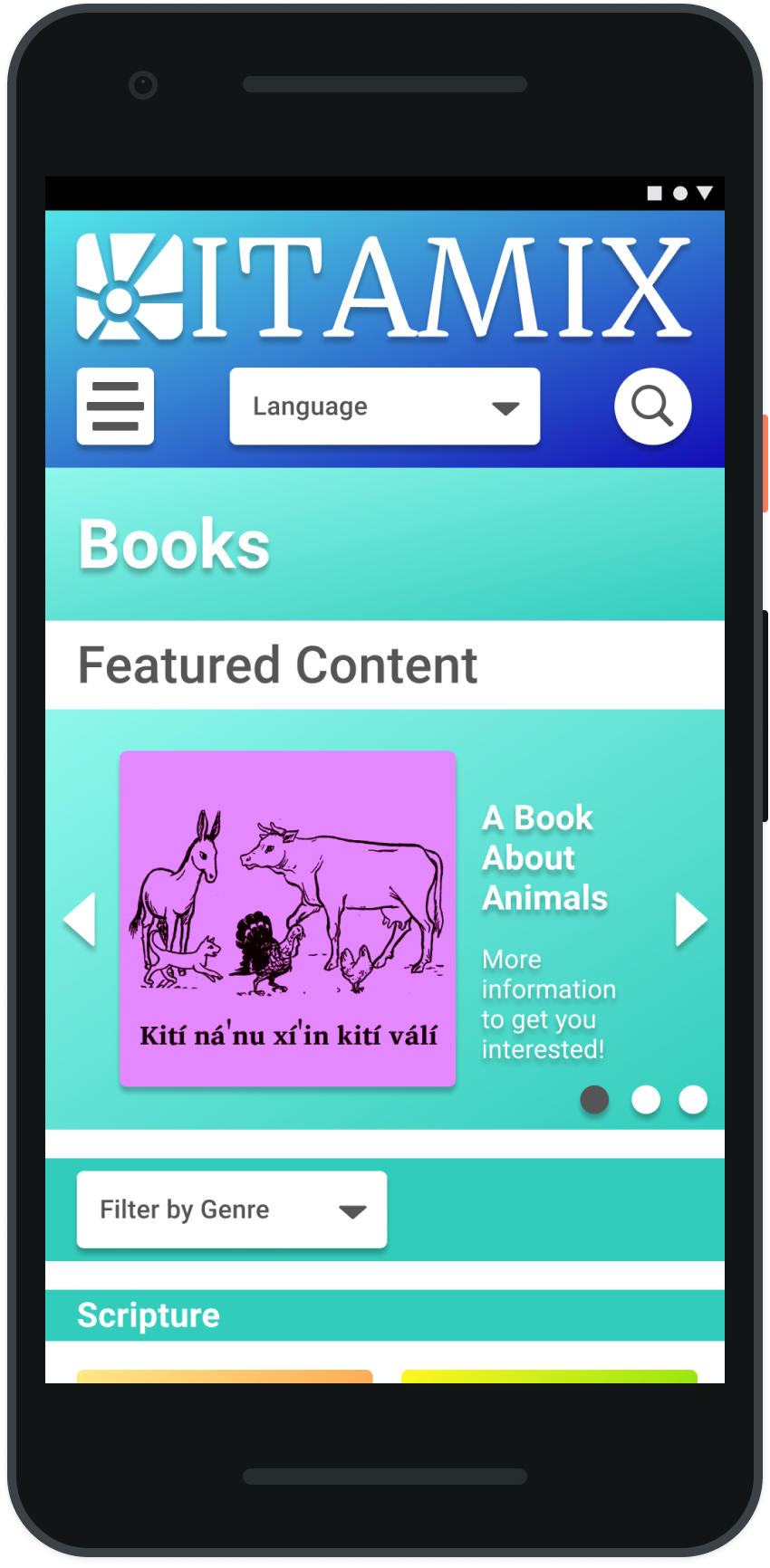
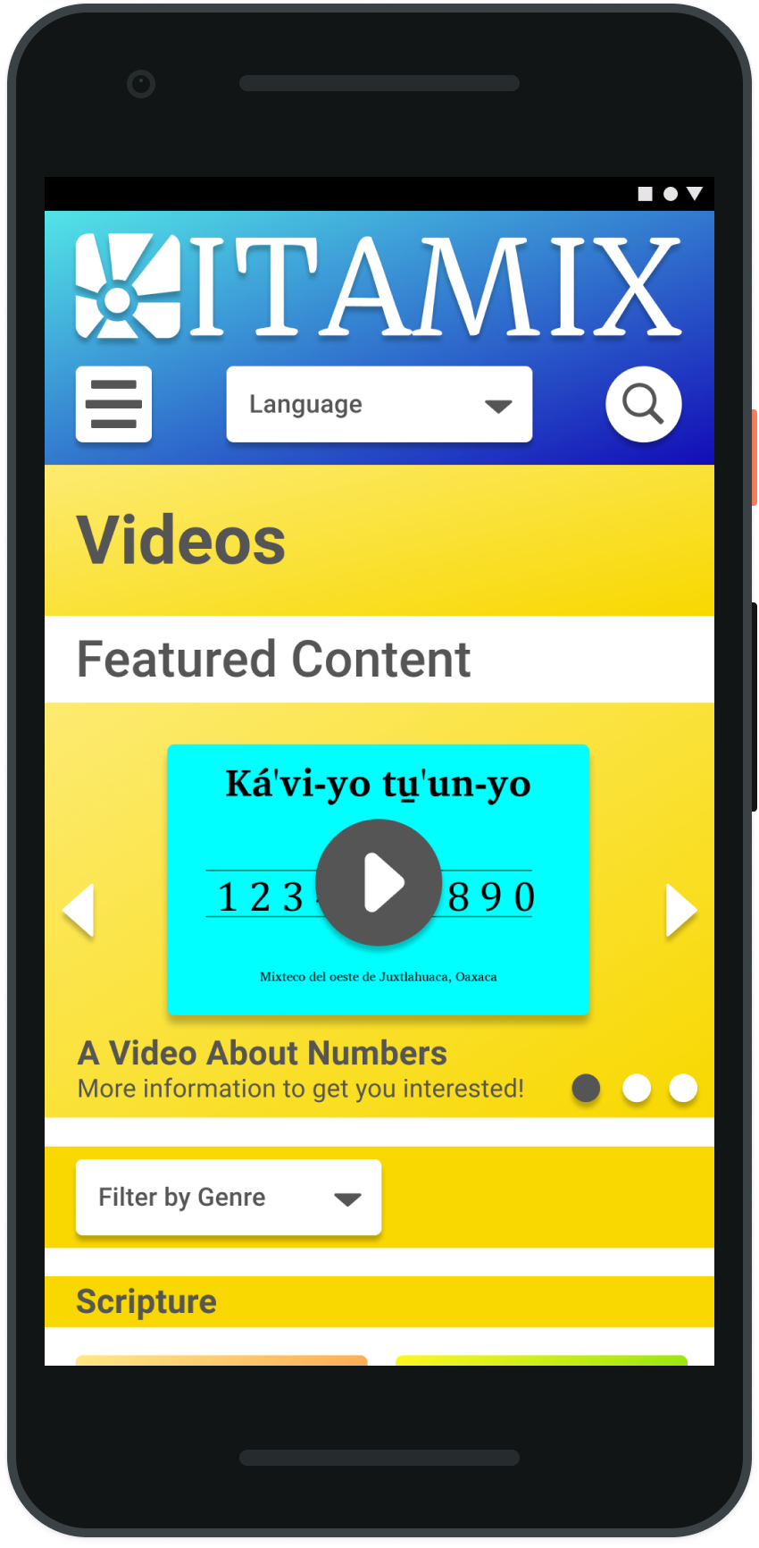
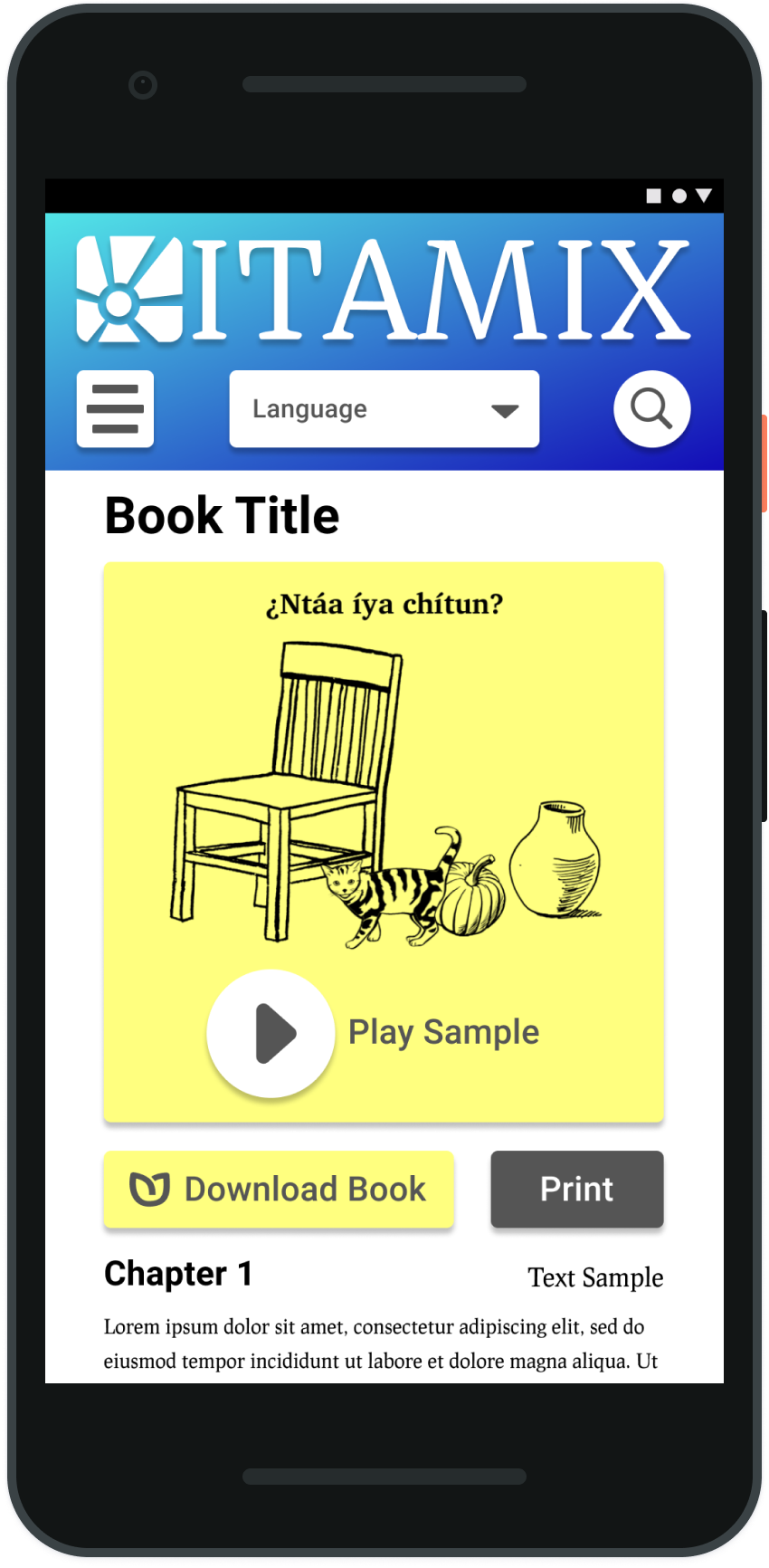
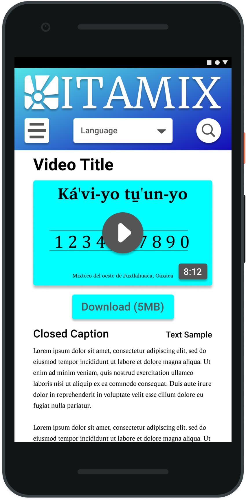
I created a mobile-first platform that allows Mixtec speakers to download materials to their phone to use with their e-reader app
Timeline
I executed this project over a 2 week sprint.
Initial Research
Discovery and Research
I interviewed the client who has done extensive ethnographic research for 15+ years of watching multiple families in the area, building deep relationships with 20+ families in the area. We discussed their insights and gathered as much information as we could about the habits and statistics of the population.
The research began to center around a need for a hub that was simple to use for a tech-illiterate population. It was clear that there was a wealth of material, but introducing reading materials, as well as videos and other media had to be presented in a captivating way to a population without reading in their cultural vocabulary.

Pain Points
Limited access to the internet, limited ability to read, unfamiliar with reading and what was available, no access to the materials without finding a printed copy at the one office operated by the linguists.
User Goals
Easy access to materials in their own language to learn, to read, and to share their culture and heritage.
The research began to center around a need for a hub that was simple to use for a tech-illiterate population. It was clear that there was a wealth of material, but introducing reading materials, as well as videos and other media had to be presented in a captivating way to a population without reading in their cultural vocabulary.
User Personas

Josephina
23 - Female
She’s a single woman with a close family connection. She’s fairly busy as a traveling merchant with her family. She’d like to become a teacher, so she’s attending classes as she can to work on her diploma. She’s close to her young brother who is 5, and her grandma. She’s fluent in speaking Mixtec and Spanish, her ability to read in Spanish is proficient, and in Mixtec she’s still developing. She does have younger friends who were able to learn more in school about reading in Mixtec and she doesn’t want to feel left out.

Sergio
28 - Male
He’s an independent man, but he’s also the caretaker for his family. He’s got a brother but he’s the one who provides financially for his family as his parents are aging. He’s a teacher who works in the schools in a nearby village, so reading is something he likes to do to stay connected to home and to keep close to stories he grew up with. He is also teaching in Mixtec, but it’s a separate dialect, so he’s trying to practice that dialect and to encourage his students to start reading for themselves.
Market Analysis
Strengths
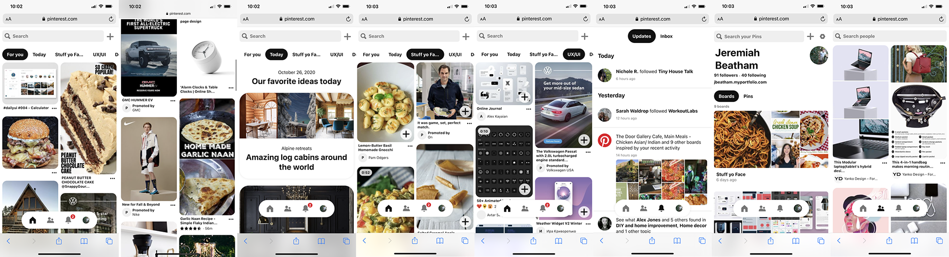
Simple navigation, highly visual interaction, continued updating to allow people to see new and novel content each time they engage with the platform. They allow for a personalized board of interests that guide the things users are shown.
Weaknesses
A lot of content at once can lead to lower commitment levels, a lesser involvement, and the users can skim rather than spending time involving the media. There’s also a possibility that with more decisions the users hesitate and have anxiety.
Opportunities
Streamline content and turn into more systematized silos. Self-published content from Pinterest would be another opportunity to explore.
WeTransfer
Strengths
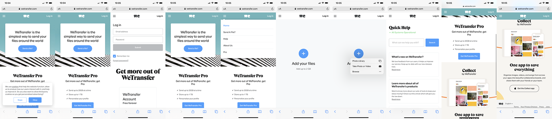
Simple interface, the limited options of what the site can do is reflected in how little there is to the site.
Weaknesses
There’s not much engagement or need for repeated returns to the site unless you’re sending lots of stuff. There’s nothing to keep a person there for updated content.
Opportunities
Add content and engagement with more personalized login and accounts to drive continuous interaction.
Empathy Map
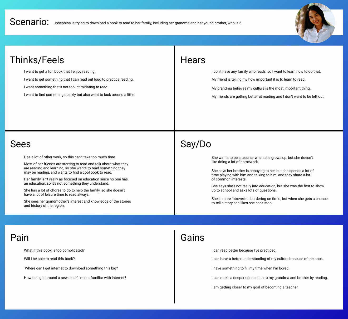
Where to Focus
With so many areas of opportunity I developed a storyboard to build a shared sense of empathy and alignment between myself and the client. This storyboard helped visualize areas of opportunity as the user proto-personas engaged with the ITAMIX digital library. The illustrated storyboard below walks through the phases of discovery, intrigue, delight, and evangelism of the library with other users.
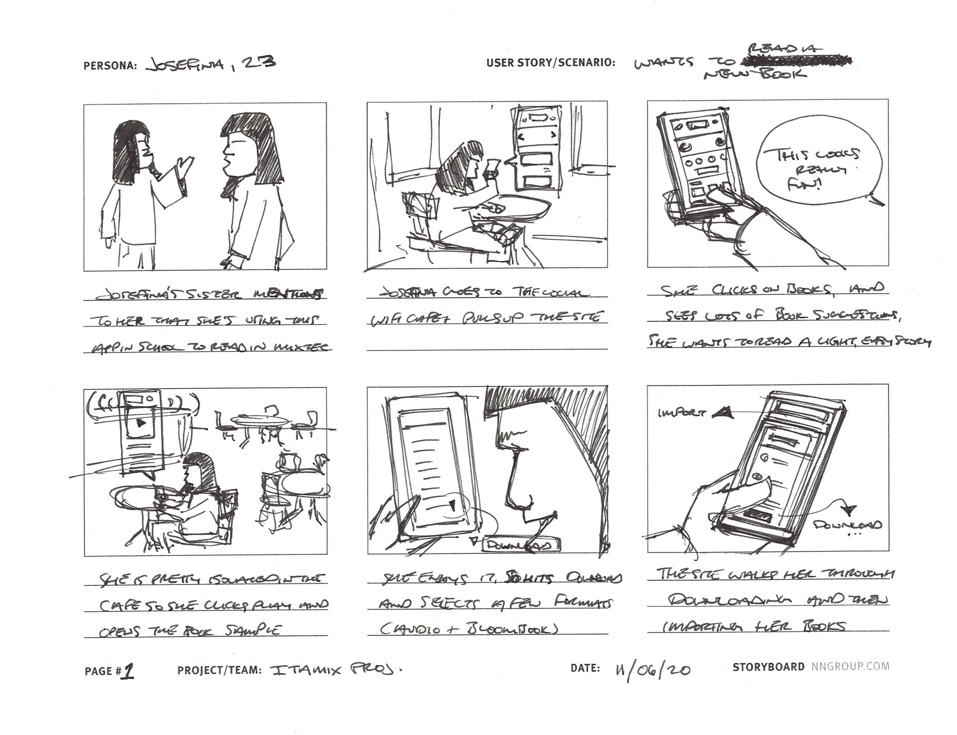
Scene 1
Josefina’s sister, a user of ITAMIX, mentions the digital library in a recent class taught by my client to read in Mixtec. Josefina is not able to read Mixtec as few in the area can, so this digital library with audio content catches her interest.
Scene 2
Josefina visits her local internet cafe to try the app for herself.
Scene 6
She is walked through the download process and imports her books for later!
Scene 3
She opens the app and taps on books, seeing some immediate suggestions, she finds something that looks intriguing, like a light, easy story.
Scene 4
She is pretty isolated in the cafe so she taps play on the book and plays her first audiobook out loud at her table at the cafe.
Scene 5
She enjoys it! She hits download and selects a few formats (audiobook and an accompanying digital book with pictures) for later when she’s no longer online.
User Journey
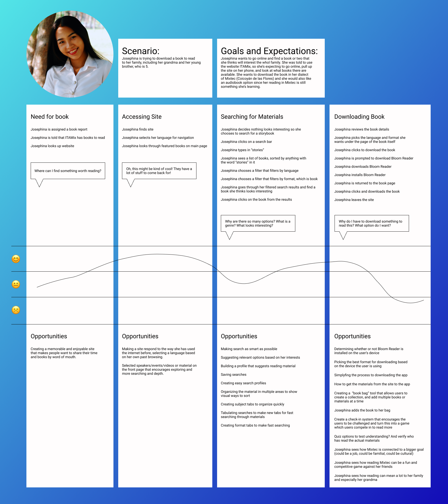
[Note to reader: This section would typically be supported by high-fidelity design mocks (before/after screens of the old process vs. the new narrative).]
5. Reflection & The Path Forward
5.1 Critical Reflection & Learning
The most valuable takeaway for a Staff/Senior Designer is demonstrating growth and strategic influence.
- Key Learning: I learned that a clearly defined user problem set in business terms can create an opportunity for business stakeholders to envision the potential for impact. I also learned that engaging technical stakeholders early and often as collaborators allows for the group to be fully aware of any constraints and also work together to find opportunities to overcome those obstacles.
- Design Leadership: I realized how to use North Star concepts (e.g., "Proficiency in 2 Hours") to influence the product roadmap and that longer-term product planning requires prioritization of features, but employing a user-centric strategy allows for releases that still make a difference for users on day one.
5.2 Next Steps
- Iterative Expansion: Apply the continuous narrative/interactive simulation model to other complex areas of the store (e.g., Deli or Pharmacy departments).
- Tracking: Establish a formalized, automated system to track Associate error rates and short-term turnover during the first 90 days to continuously validate the training ROI.
- Content Management: Build a system for Associates to quickly access updated training modules when POS enhancements or new standards are released, solving the feeling of being "unupdated."
High Priority Goals
- As a Mixtec Speaker from Coicoyán I want to pick my language so that I can browse the material in my own language.
- As a Non-Reading Mixtec Speaker I want to search with as little reading as possible, so that I can find material without reading.
Medium Priority Goals
- As a New Reader I want to find easy material so that I can practice and improve reading.
- As an Excited Reader I want to find shareable things so that I can involve my family and friends as I read.
- As someone who pays for internet by the byte I want to know what I am about to read before I download it so I can be conservative with costs.
- As someone with an entry-level phone I want to sample the content to save space on my phone for only my favorite things.
Stretch Goals
- As a Member of the Mixtec Community I want to see what other people are reading and saying so that I can stay connected to the spreading Mixtec population.
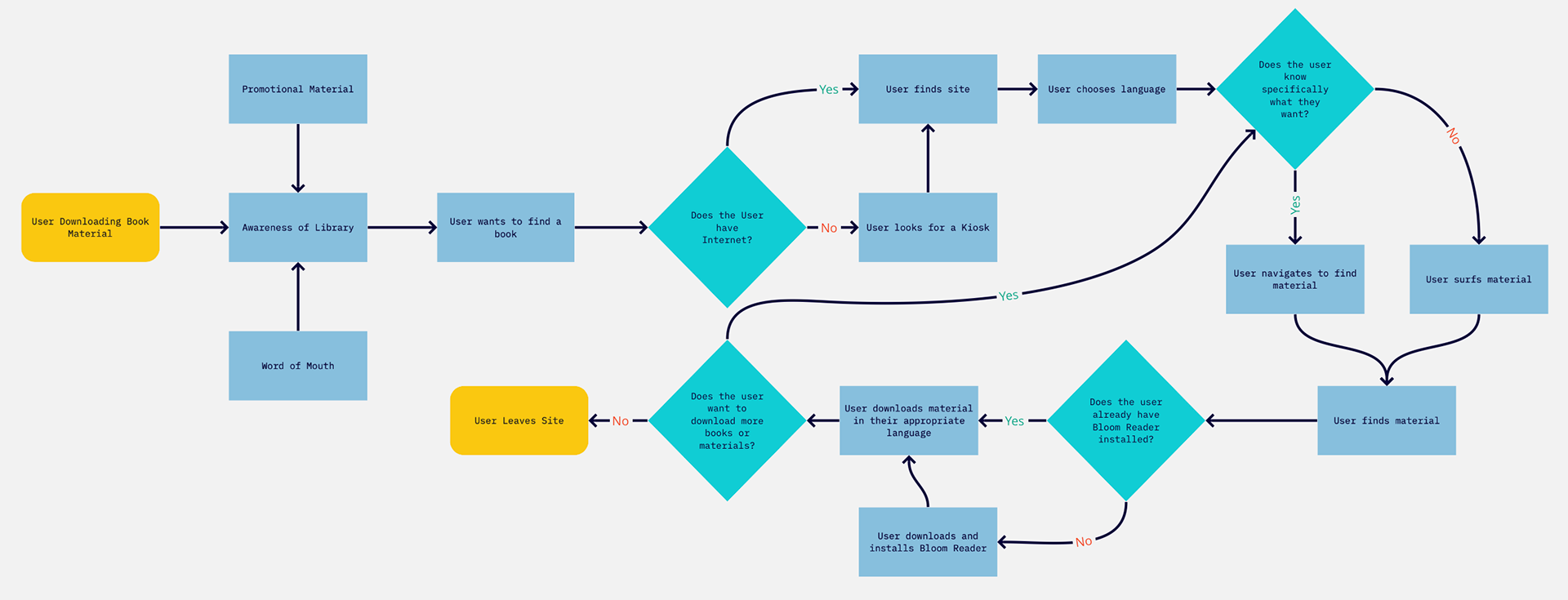
User Flow
This is a flow showing the various required and optional steps the user may take, even considering the unhappy path scenario of no internet, and focusing on how the user would download content from the digital library.
Wireframing the Structure
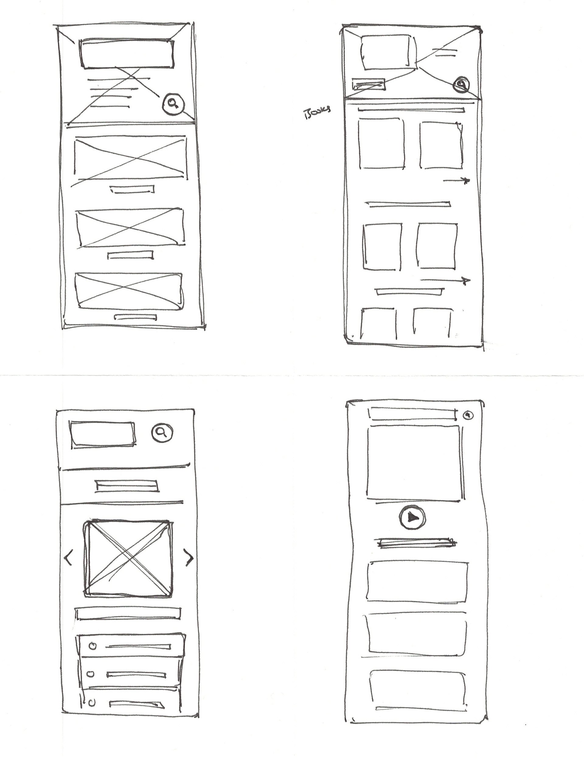
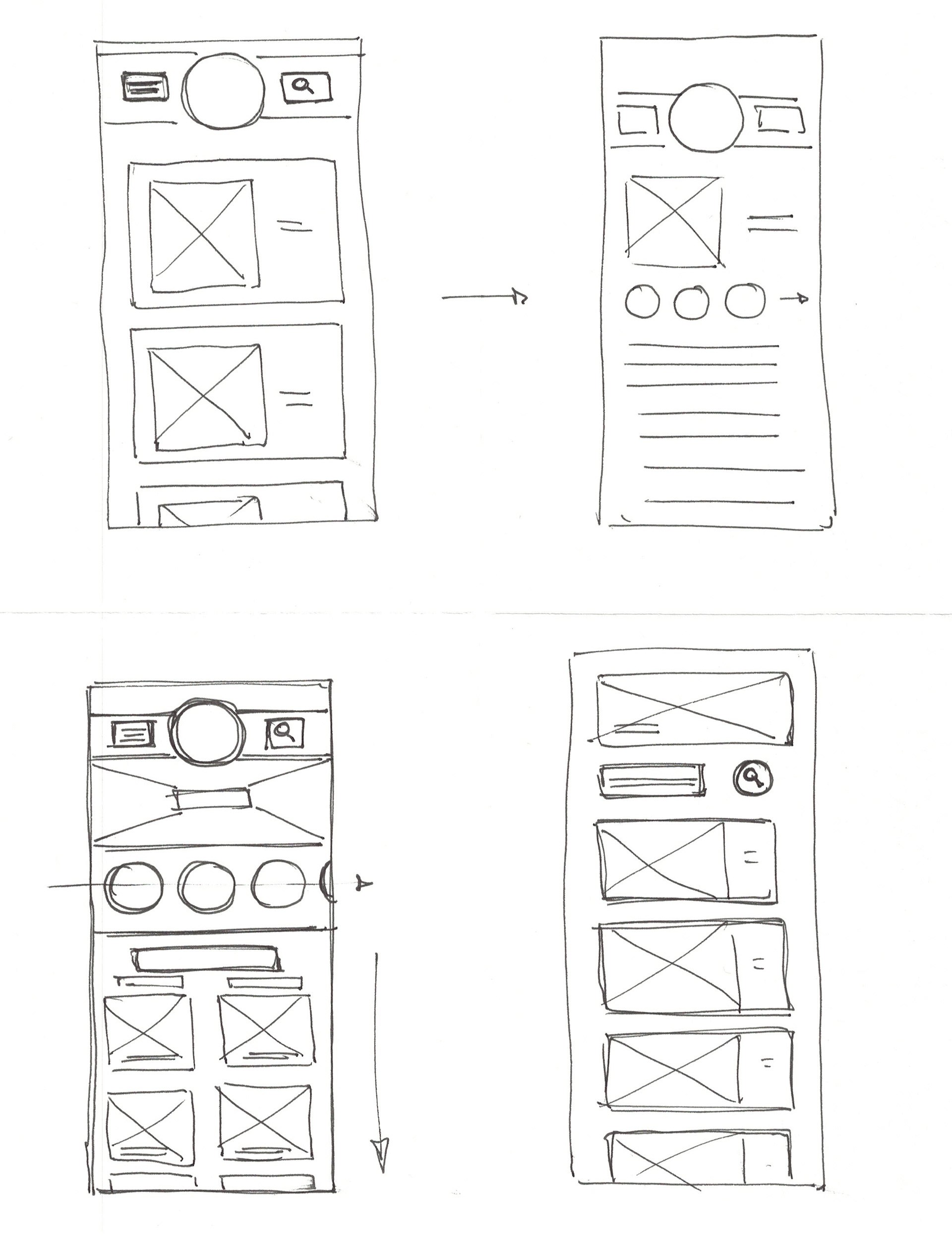
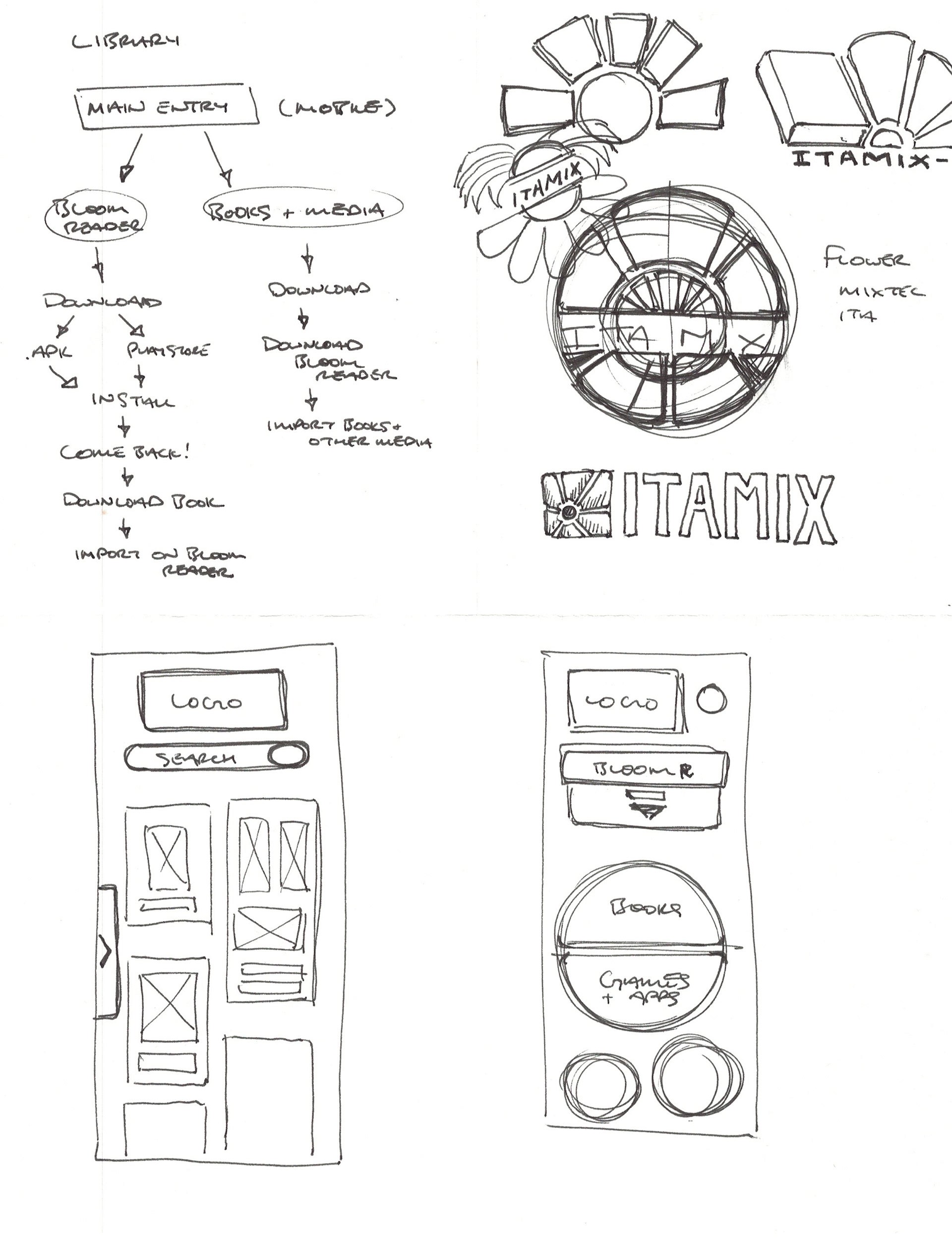
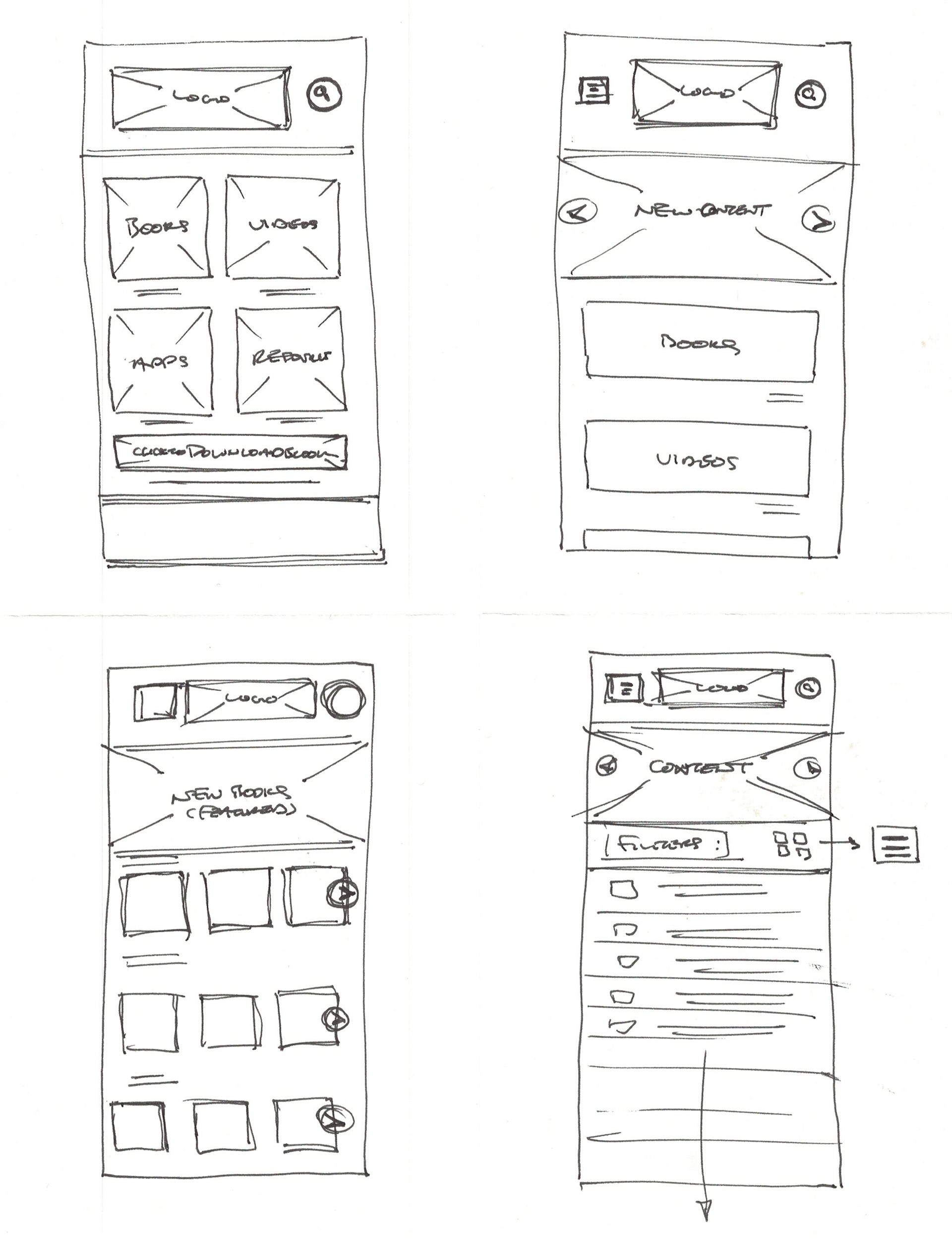
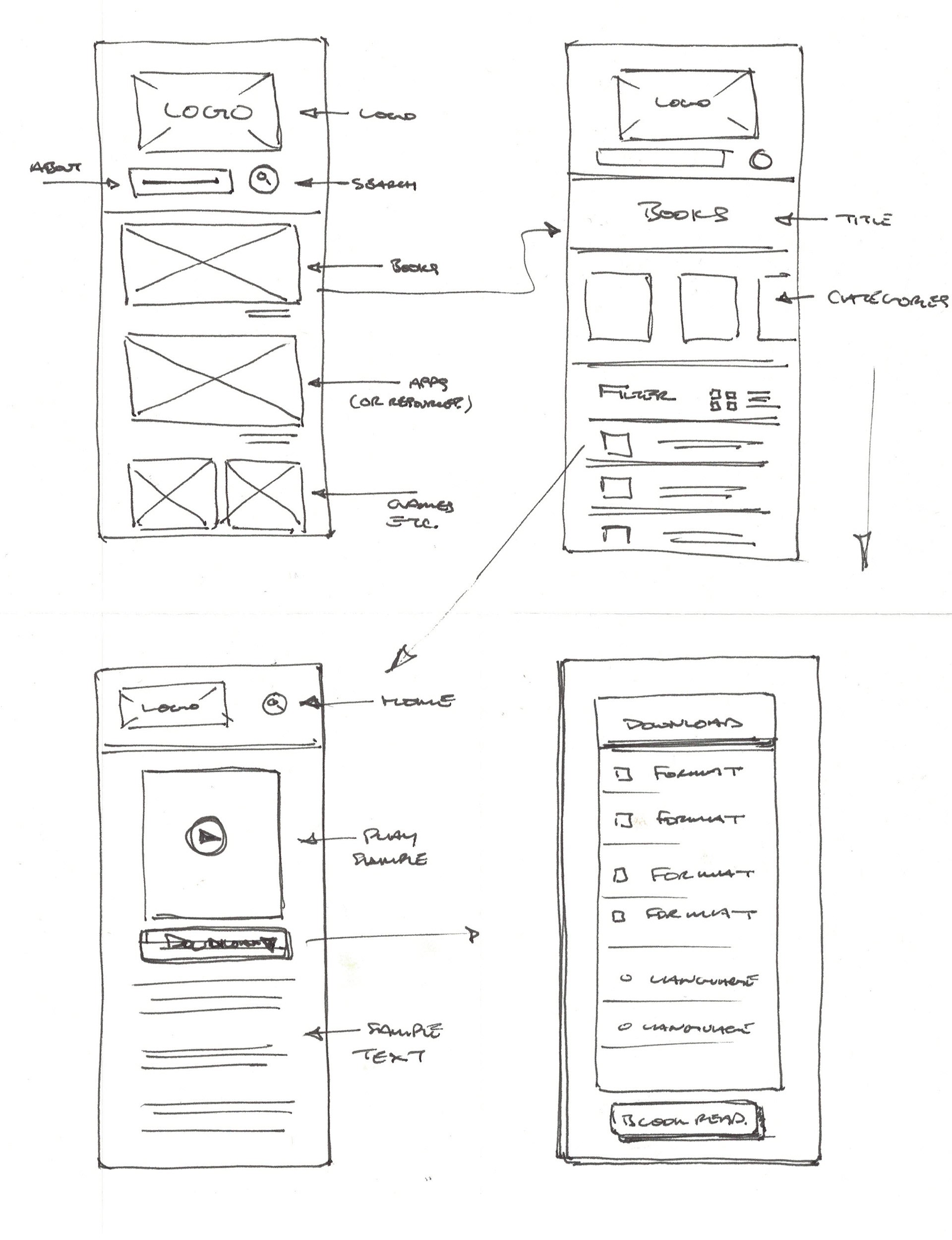
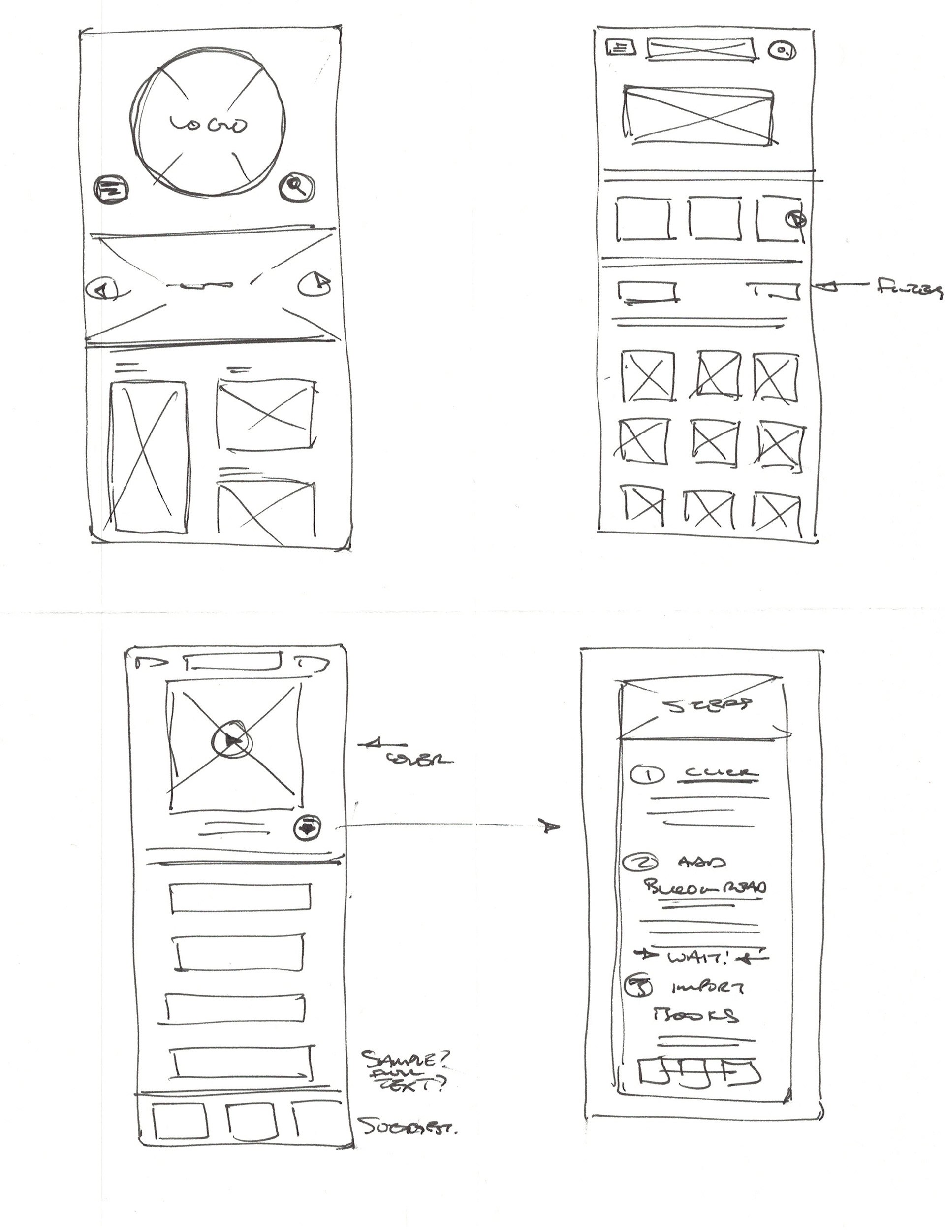
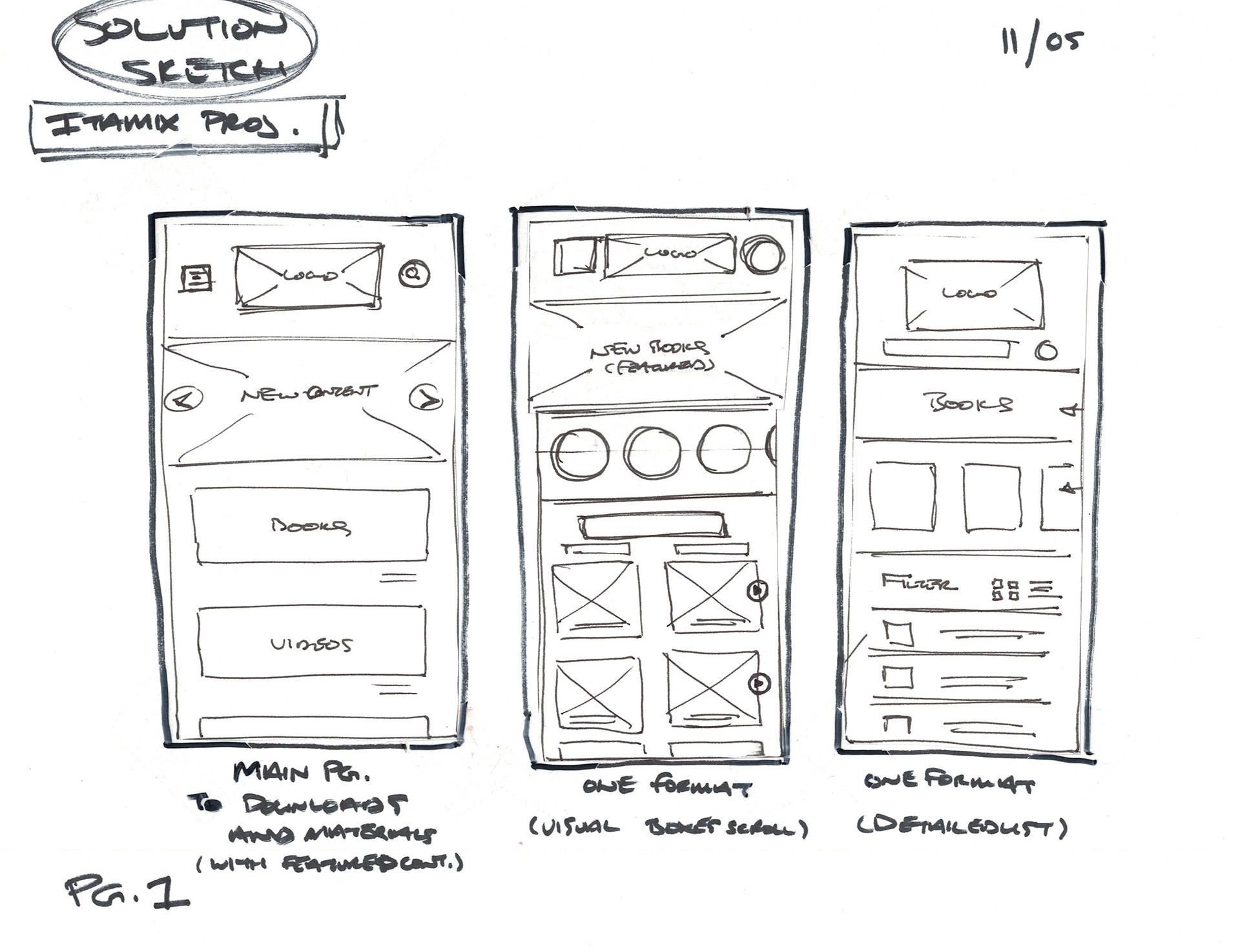
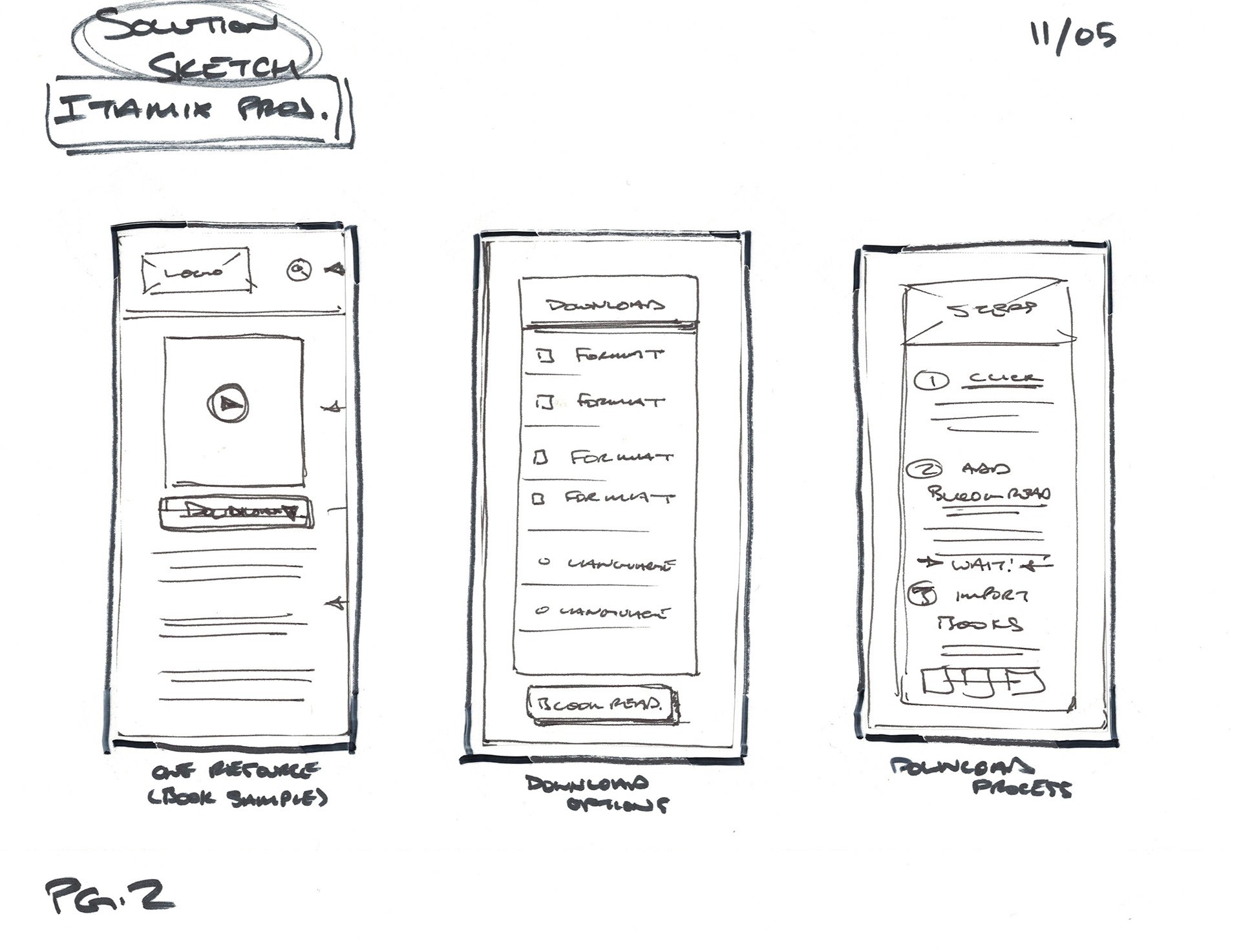
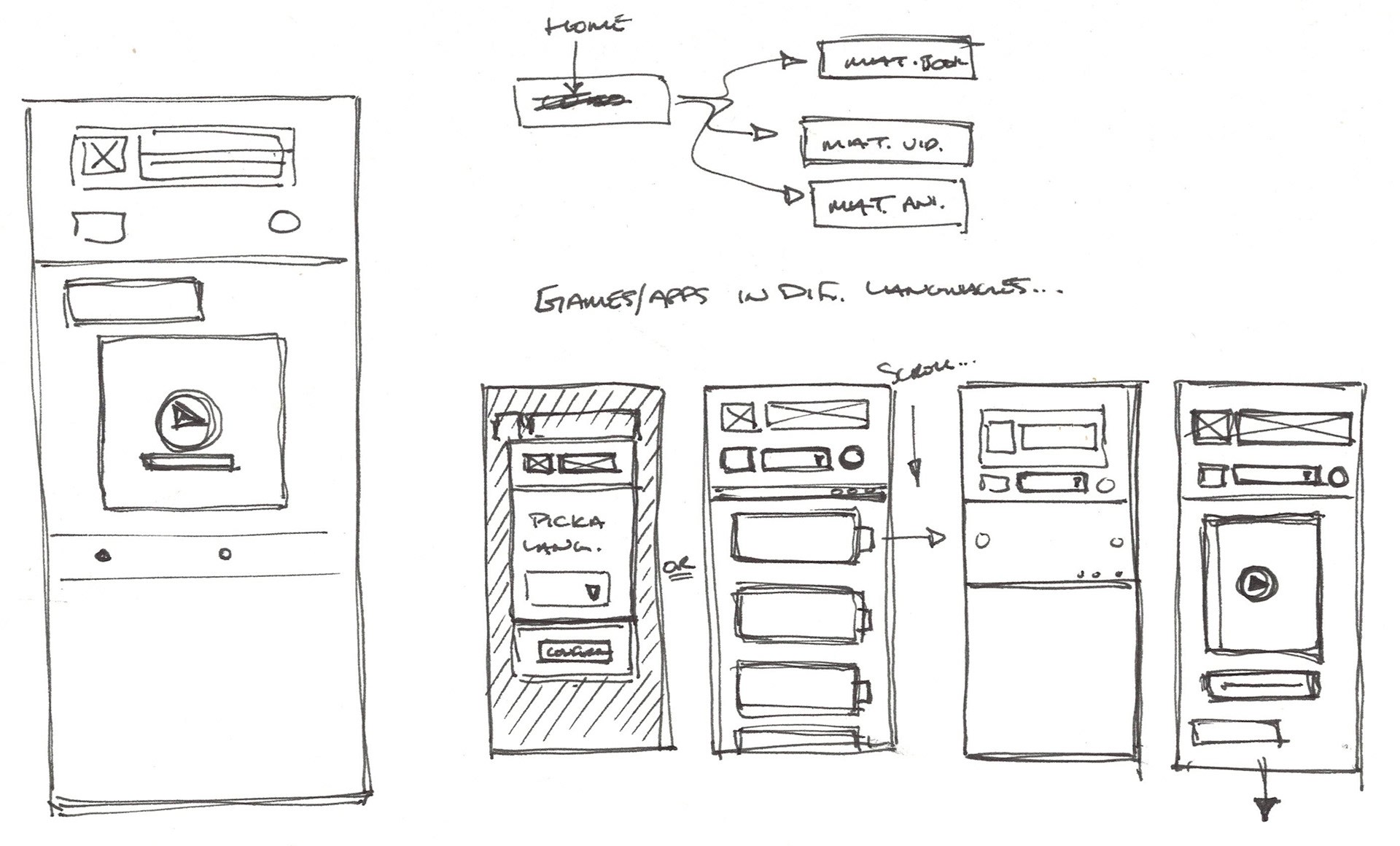
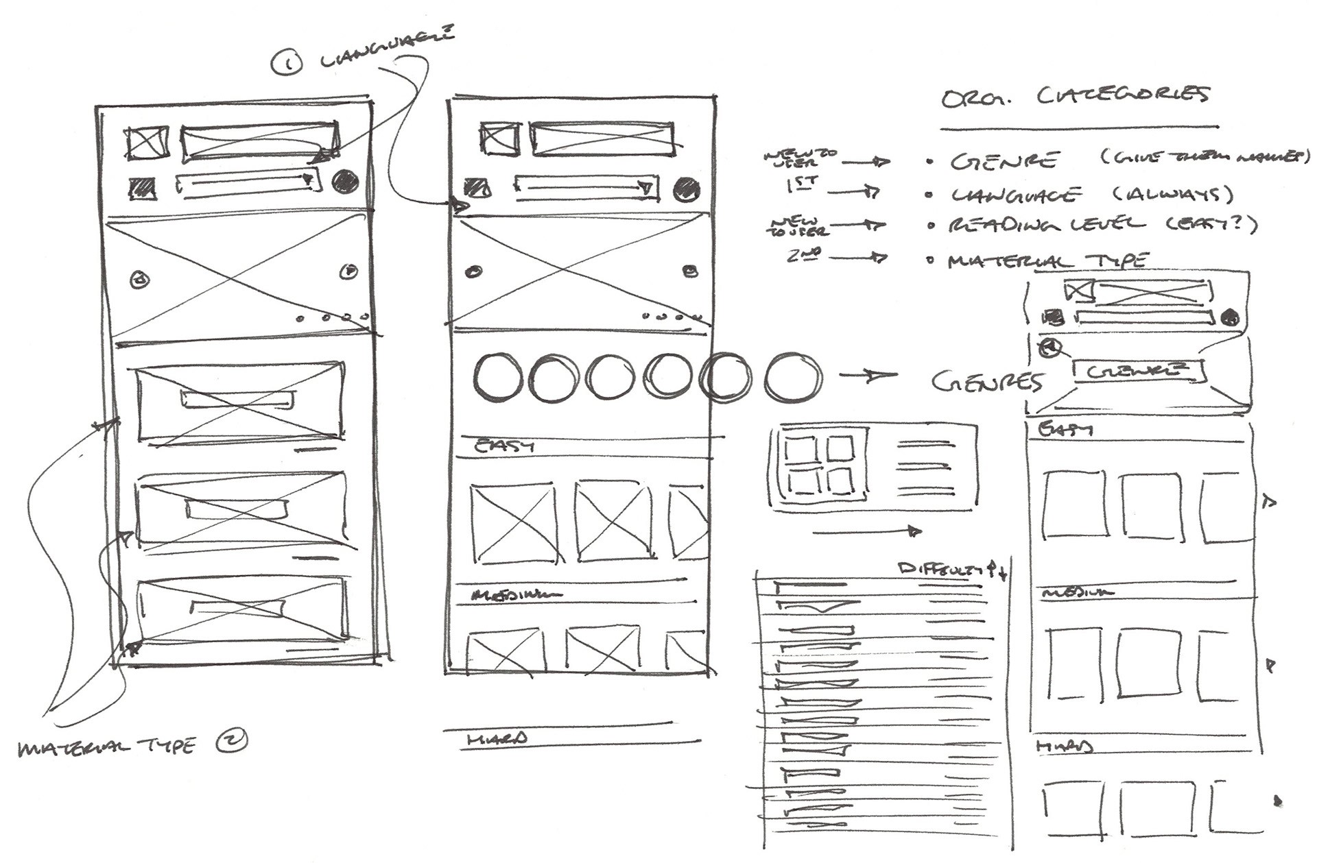
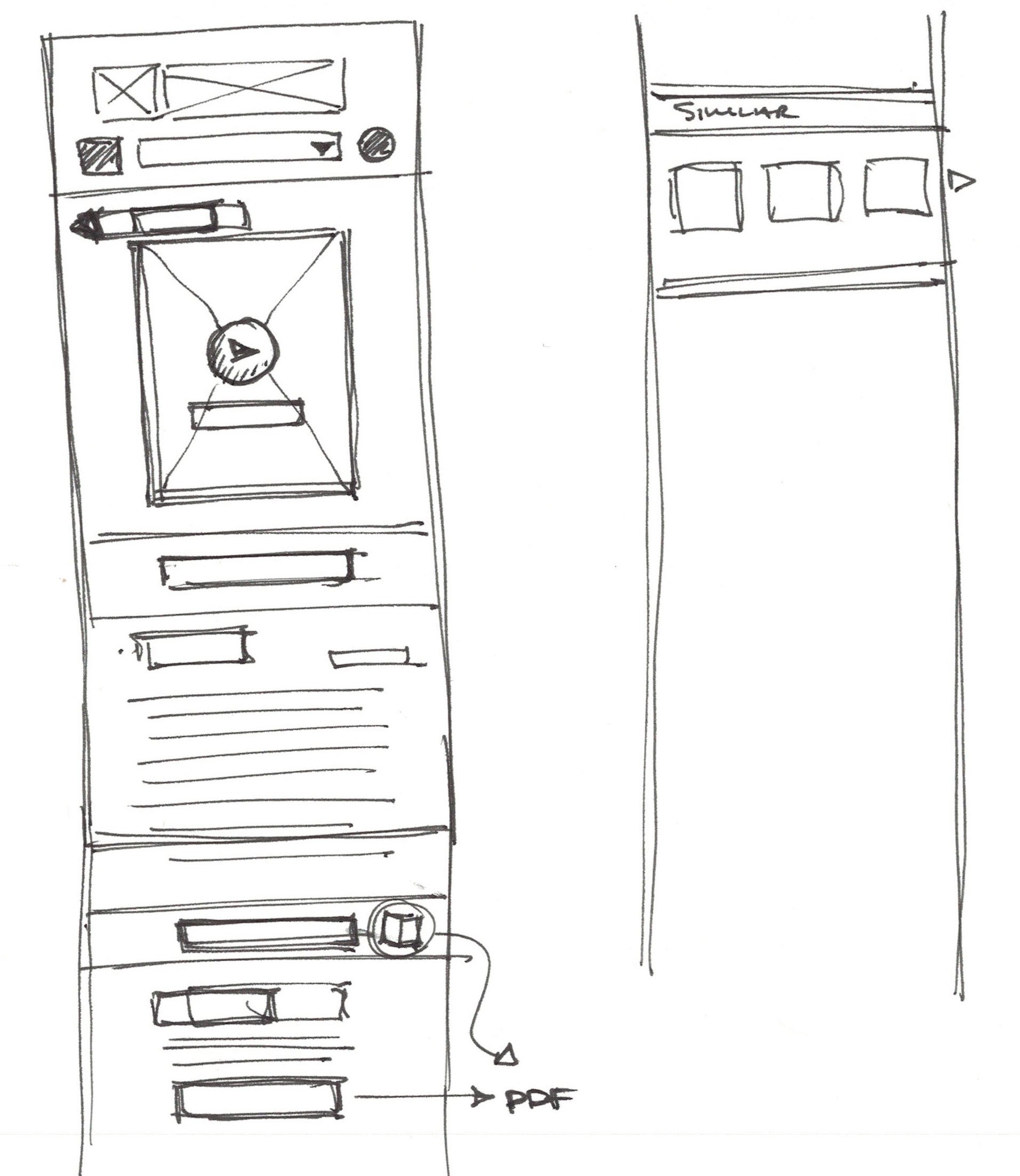
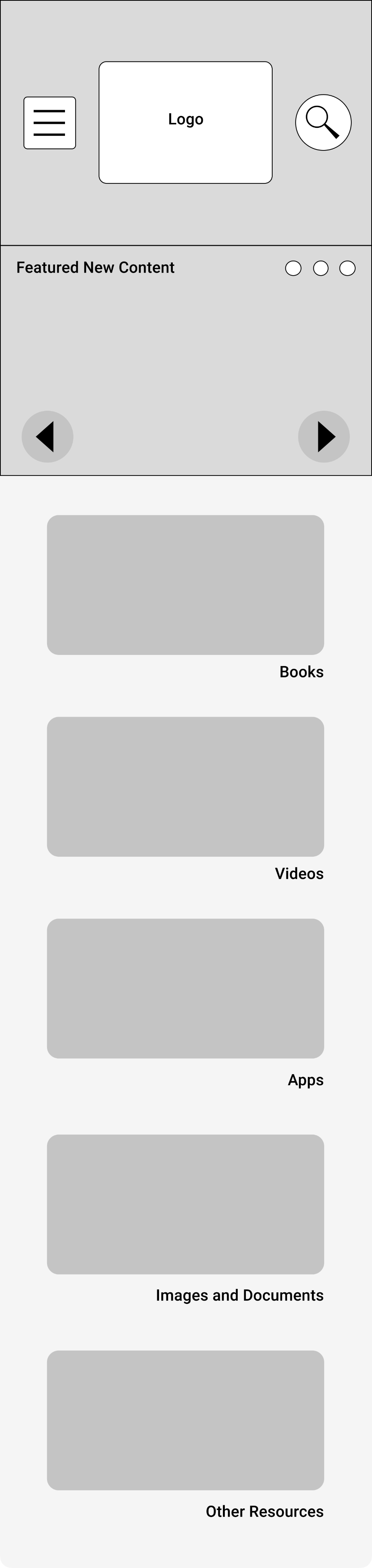
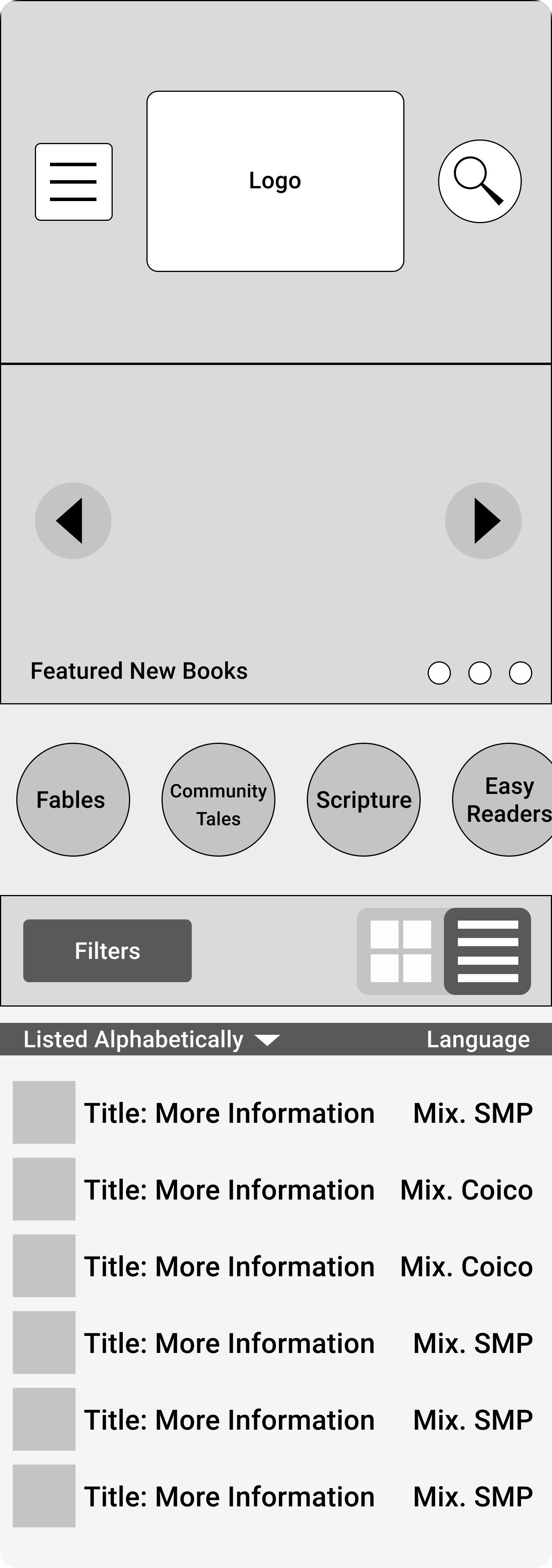
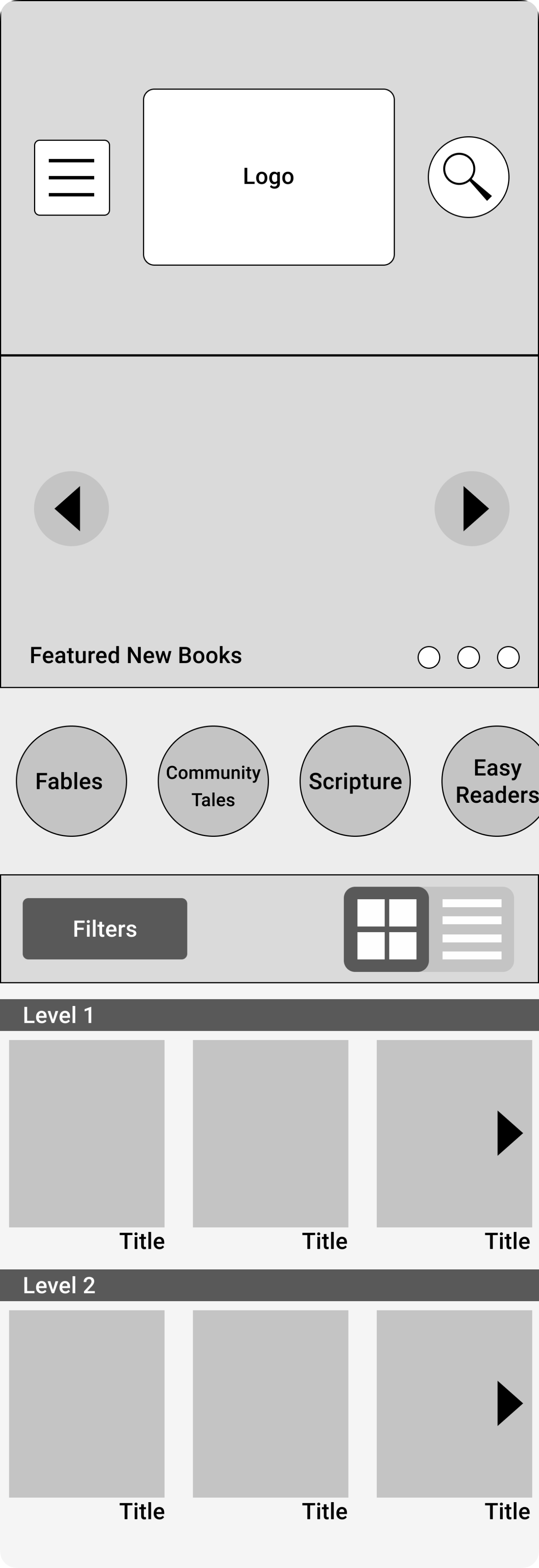
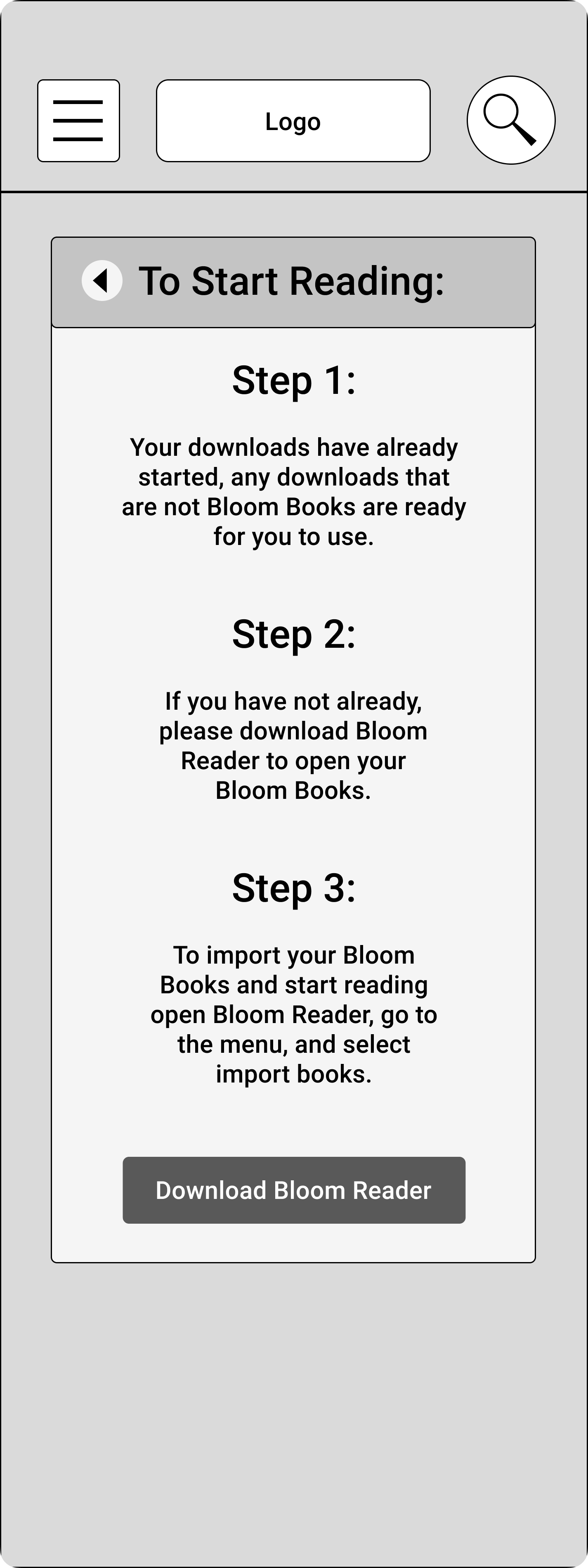
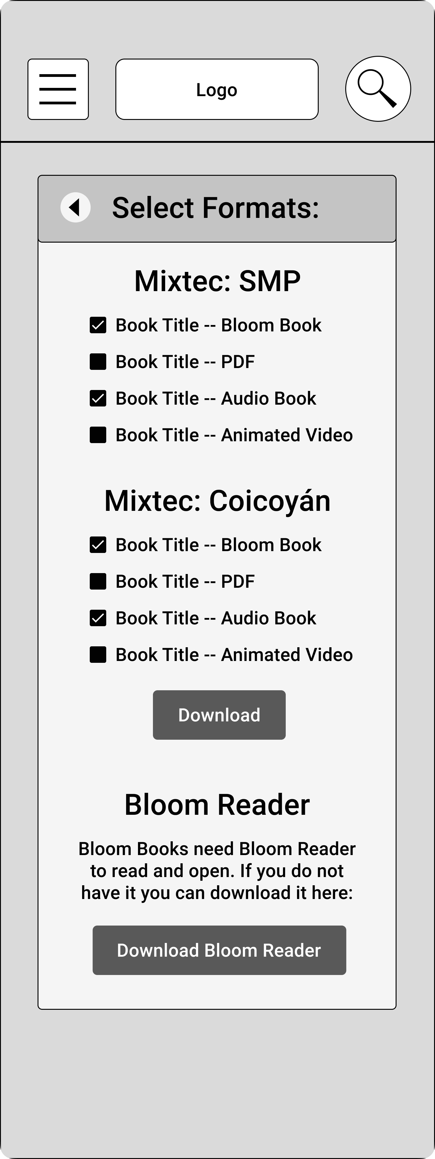
I created rapid paper prototypes for early play-testing, running through the jobs to be done with my stakeholders and friends and family in person and virtually. Early testing highlighted the need to choose a language earlier on in the flows so that the users could select their native language for their entire experience. Another opportunity was highlighting the formats of what was available to download. Through this lens I asked myself what the user really needed, and what was too much information for someone like Josephina who isn't a Digital Native. These sketches informed a series of low-fidelity wireframes for usability testing.

Raising the Fidelity
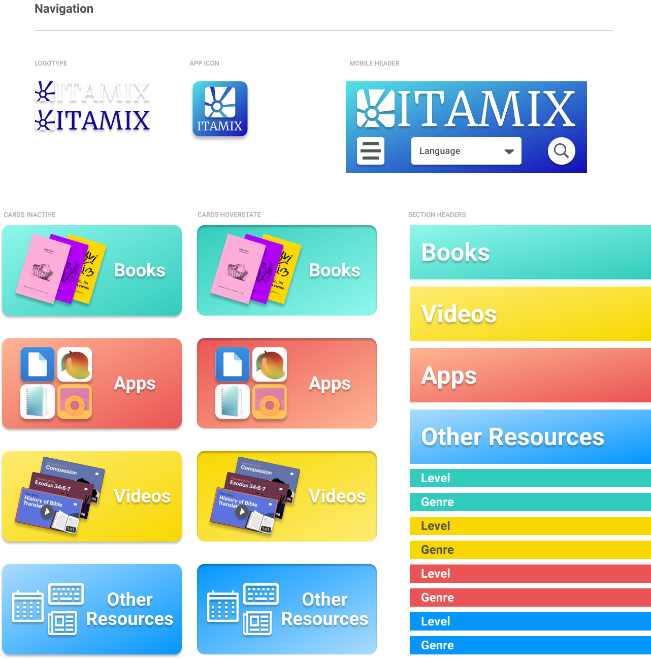
Design System Framework
From the wireframes and sketches I created a cursory UI kit to create reusable patterns for consistency and efficiency. My goal was to make the experience feel youthful, trustworthy, engaging, and educationally accessible for anyone.
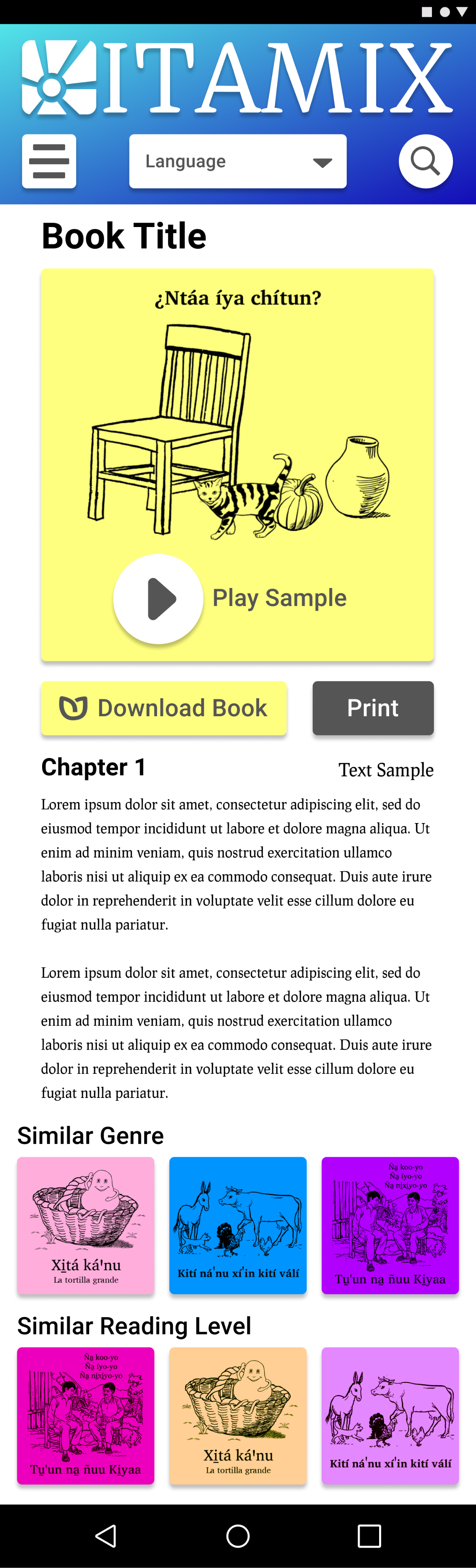
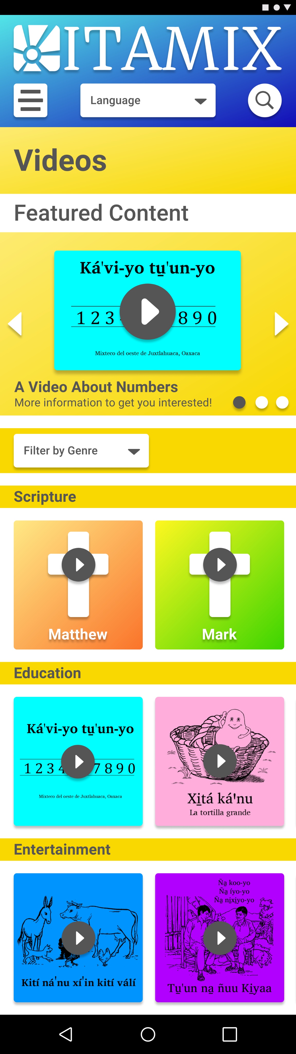
My stakeholders currently use a simple, cost-effective format for their physical library: black and white printing on brightly colored card stock covers. This bright color cue was an easy connection point for this UI kit. I also paired it with a simple typeface that could support multiple languages with very specific characters and load quickly without adding expensive packages to the project.
The goal was to identify ITAMIX’s
- Character
- Mood
- Color Palette
- Core Typefaces
- Simple Logo
- Core Screen Layouts
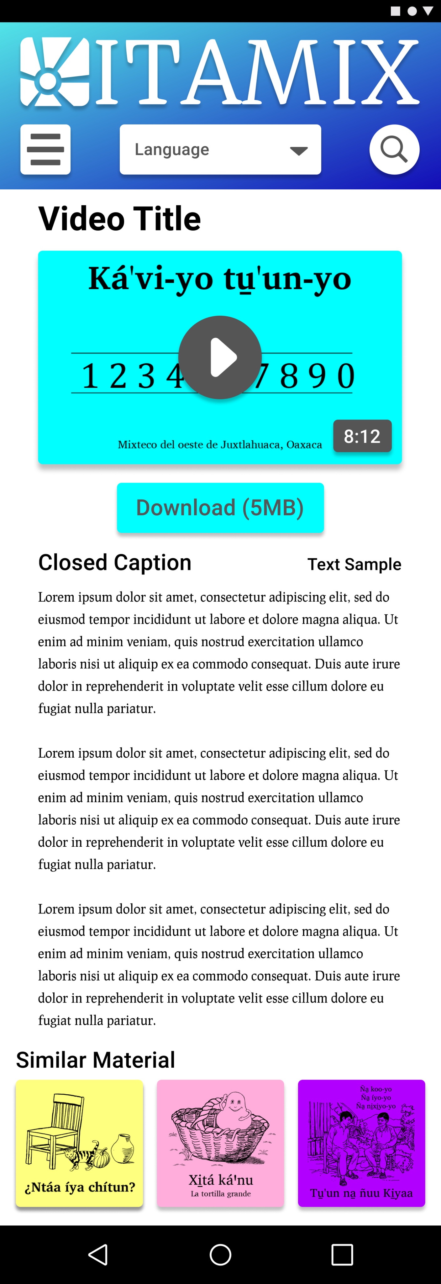
This UI kit, while being basic, helped me lay out a clear and higher fidelity prototype in very little time to spend time focused on the patterns and flows and sticking points, rather than making each screen from scratch.
Usability Testing
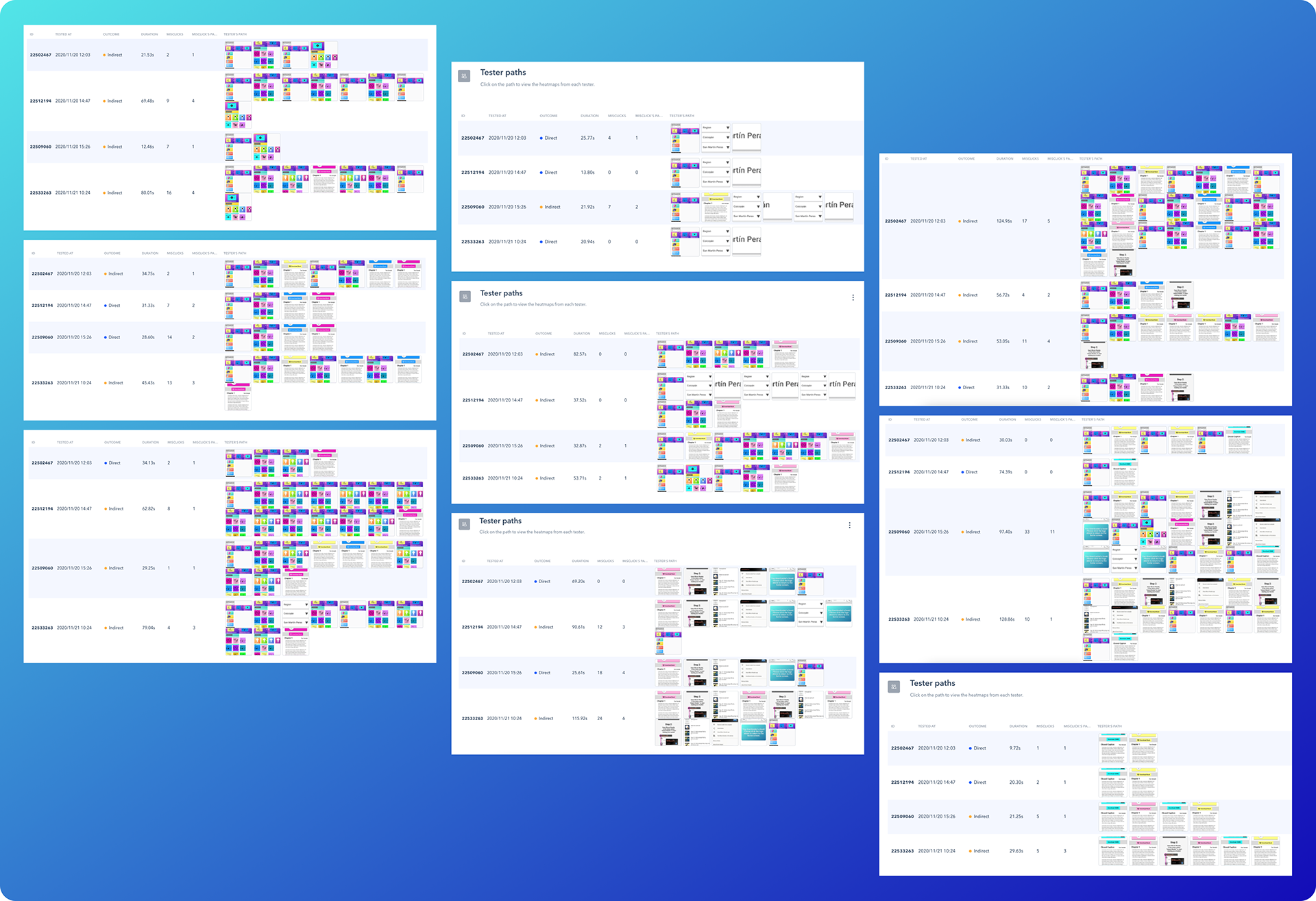
This is an output of the tests I ran on Maze, including testing paths, time taken per task, the screens visited, and areas of higher activity.
Test Planning
The biggest hurdle I encountered in my testing was access to the end user demographic, which was concentrated 2,200 miles away, and was not reliably on any internet platform, a key need for this product in the first place.
To solve this I focused on the biggest obstacle for Josephina or Sergio: the non-native language, and possibly a low or non-existent level of reading. To recreate this hurdle I created a prototype of key flows and interactions, then used Lorem Ipsum copy to simulate a foreign language for my test users, some of whom spoke English and Spanish.
I recruited and screened my friends, family, nearby neighbors, and strangers from a forum on Reddit to take my test.
Test Method and Goals
My goal was to understand the clarity of navigation and imagery to guide users to the content without reading. I also wanted to understand if the process to download content and the accompanying app for playback was clear, and lastly what users might think of content suggestions.
I began with a survey to understand some of the key behaviors for users of other library systems to inform my future plans for this product. Then I tested 8 core jobs to be done. I used Maze to share the link, whether testing remotely (5 Users) or in person (4 Users) so I could see the user paths and record the sessions for later synthesis.
Tasks Tested
Pick a Language
Users had to figure out how to navigate to select the relevant language.
Find an Easy Book
Users were given a theme and were asked to pick a book that would be fun for a 5 year old.
Download Books
Users were asked to look for a way to get the content onto their phones for later, as well as being asked to find another book for themselves.
Checking Weekly Section
Users were asked to return to the homepage to see what featured content caught their eye that was not just a book.
Look for Related Content
Users were asked to dig around for something similar to the featured content they chose.
Find Something Shareable
Users were asked to find content with a specific theme and included options for them to share it.
Find a Challenging Read
Users were asked to find a complex piece of content.
Find Something New
Users were asked to find yet another piece of media related to a new topic.
Test Findings
Confirmed Findings
- Users had 100% success on tasks
- Genres stood out as an effective way to navigate
- Reading levels made sense for users to find various content types
- User gravitated toward the suggested content to find their next piece of content, and users who used the suggested content seemed to visit more unique pages
- Users intuitively played the samples as they browsed
- Downloading the companion e-reader app was simple for users
- Users became more familiar and gravitated toward search the longer they stayed in the experience
- Users quickly understood the information architecture of the app after just a short period
How Might We...
- Clarify the region selector to underline the various language options supported?
- Streamline the companion e-reader process to eliminate drop-off for busy users?
- Illustrate the steps to move downloaded books to the e-reader, especially for non-digital native users?
- Tie the step from downloading the book directly to opening the book?
- Clarify when there was more content that could be scrolled through?
- Distinguish the download formats more clearly?
- Allow filtering for multi-format materials?
Sprint Outcome
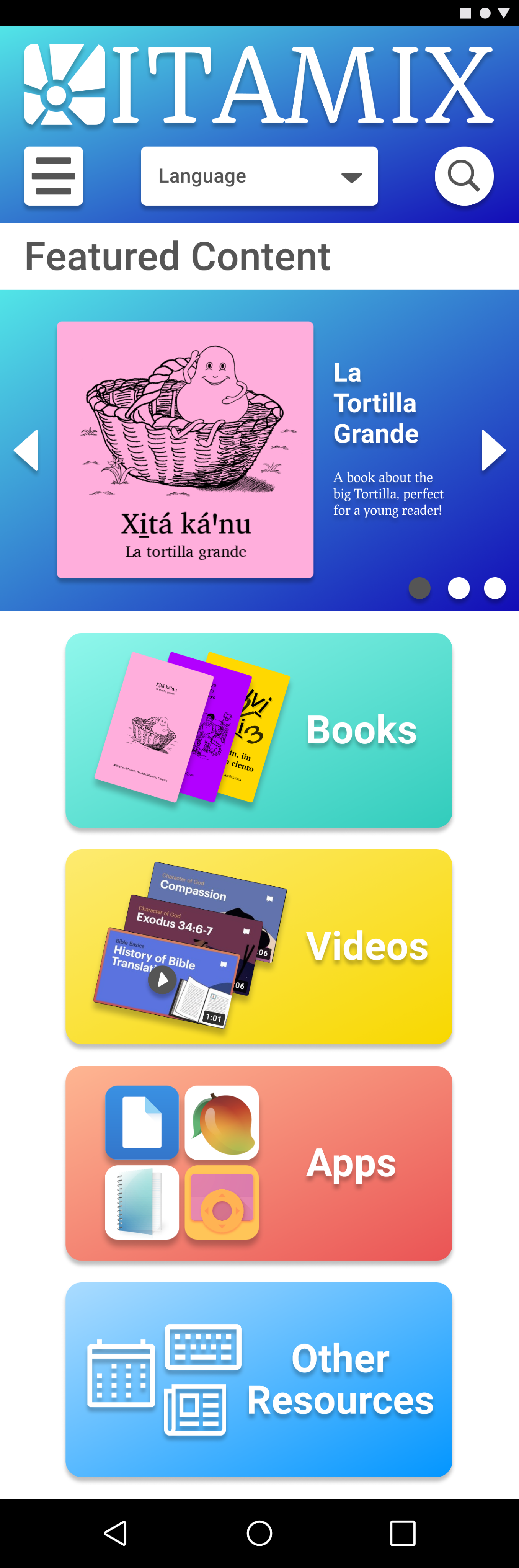
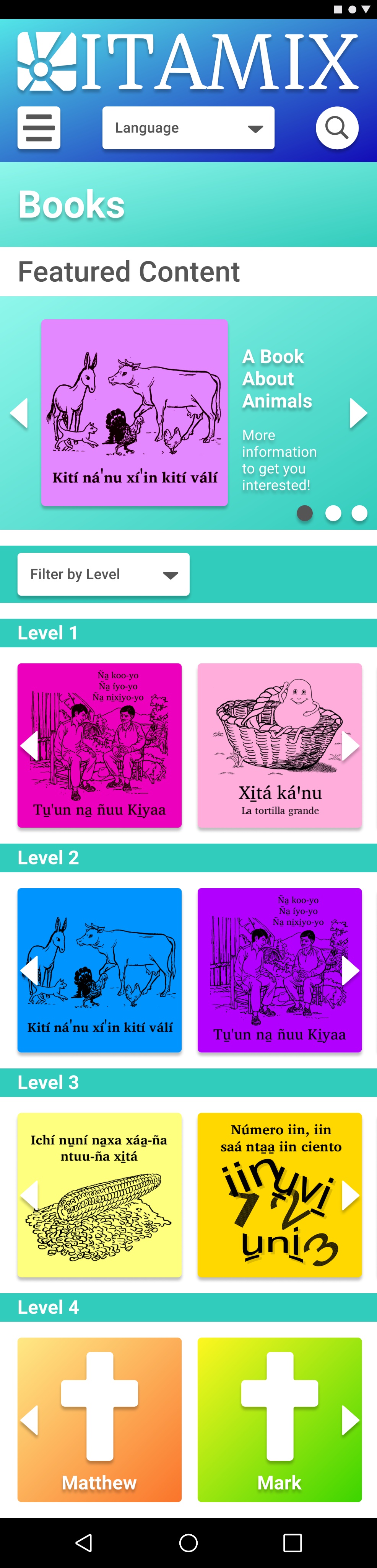
The final hi-fidelity mockups with supporting findings gave the stakeholders a clear vision to begin development efforts, with the confidence that they could put an early idea into the hands of users soon with a concrete expectation of success.
My Key Takeaways
- Unmoderated tests and interviews are incredibly powerful when properly prepared to facilitate a much wider range of participants
- Guiding users with given goals within realistic scenarios can identify if they would choose to accomplish those goals in the same way as I originally expect and unearth their assumptions
- Being specific over a series of smaller tasks can give more granular results for detailed interaction questions and tests
- Establishing an early UI Kit helped multiply the later efforts of prototyping at a clearer fidelity
- Repeated check-ins with stakeholders can keep from establishing a direction without their buy-in, and is an essential part of building trust when looking to deliver research findings
Next Steps
- There is opportunity to refine an A/B test some of the download buttons by offering separate or combined e-reader and material downloads
- Clarifying the type of material clearly
- Breaking down the expectation for levels, possibly with an onboarding flow to gauge the reader’s experience
- Using motion to arrange the pages and give more hints as to the extent of the content available
- Exploring options for how to select genre or level in the sorting experience
- Testing for how to categorize Scripture and other specialized content
- Collapsing the closed captioning to become and expandable experience instead of a default load
- Exploring the technical limitations or API availability to simplify the e-reader download experience
- Logins and accounts exploration
- Community contributions and sharing

ITAMIX Digital Library

Overview

A mobile-first library system putting native-language reading materials in the palms of Mixtec speakers.
Role
I was the sole UX/UI Designer, I worked with the client to gather research data, worked with mentorship to get outside opinions and feedback, and then extracted pain points, insights, priorities that all fed the ideation and the first MVP leading on to usability testing, which I then conducted and analyzed to plan next steps. Branding and visual language was established in conjunction with client inspiration.
Problem
Linguists in the Southern Oaxaca area are preserving the Mixtec language and culture through literacy work, but there is no digital tool for Mixtec Speakers to access the materials that have been created.
Audience

The small Southern Villages of Coicoyán and San Martín Peras, limited to the few Western Juxtlahuaca Mixtec-speaking villages.
Solution

I created a mobile-first platform that allows Mixtec speakers to download materials to their phone to use with their e-reader app
Timeline
I executed this project over a 2 week sprint.
Initial Research
Discovery and Research
I interviewed the client who has done extensive ethnographic research for 15+ years of watching multiple families in the area, building deep relationships with 20+ families in the area. We discussed their insights and gathered as much information as we could about the habits and statistics of the population.
Pain Points
Limited access to the internet, limited ability to read, unfamiliar with reading and what was available, no access to the materials without finding a printed copy at the one office operated by the linguists.
User Goals
Easy access to materials in their own language to learn, to read, and to share their culture and heritage.
The research began to center around a need for a hub that was simple to use for a tech-illiterate population. It was clear that there was a wealth of material, but introducing reading materials, as well as videos and other media had to be presented in a captivating way to a population without reading in their cultural vocabulary.
User Personas
Josephina

23 - Female
She’s a single woman with a close family connection. She’s fairly busy as a traveling merchant with her family. She’d like to become a teacher, so she’s attending classes as she can to work on her diploma. She’s close to her young brother who is 5, and her grandma. She’s fluent in speaking Mixtec and Spanish, her ability to read in Spanish is proficient, and in Mixtec she’s still developing. She does have younger friends who were able to learn more in school about reading in Mixtec and she doesn’t want to feel left out.
Sergio
28 - Male
He’s an independent man, but he’s also the caretaker for his family. He’s got a brother but he’s the one who provides financially for his family as his parents are aging. He’s a teacher who works in the schools in a nearby village, so reading is something he likes to do to stay connected to home and to keep close to stories he grew up with. He is also teaching in Mixtec, but it’s a separate dialect, so he’s trying to practice that dialect and to encourage his students to start reading for themselves.
Market Analysis
Strengths
Simple navigation, highly visual interaction, continued updating to allow people to see new and novel content each time they engage with the platform. They allow for a personalized board of interests that guide the things users are shown.
Weaknesses
A lot of content at once can lead to lower commitment levels, a lesser involvement, and the users can skim rather than spending time involving the media. There’s also a possibility that with more decisions the users hesitate and have anxiety.
Opportunities
Streamline content and turn into more systematized silos. Self-published content from Pinterest would be another opportunity to explore.
WeTransfer
Strengths
Simple interface, the limited options of what the site can do is reflected in how little there is to the site.
Weaknesses
There’s not much engagement or need for repeated returns to the site unless you’re sending lots of stuff. There’s nothing to keep a person there for updated content.
Opportunities
Add content and engagement with more personalized login and accounts to drive continuous interaction.
Empathy Map
Where to Focus
With so many areas of opportunity I developed a storyboard to build a shared sense of empathy and alignment between myself and the client. This storyboard helped visualize areas of opportunity as the user proto-personas engaged with the ITAMIX digital library. The illustrated storyboard below walks through the phases of discovery, intrigue, delight, and evangelism of the library with other users.
Scene 1
Josefina’s sister, a user of ITAMIX, mentions the digital library in a recent class taught by my client to read in Mixtec. Josefina is not able to read Mixtec as few in the area can, so this digital library with audio content catches her interest.
Scene 2
Josefina visits her local internet cafe to try the app for herself.
Scene 3
She opens the app and taps on books, seeing some immediate suggestions, she finds something that looks intriguing, like a light, easy story.
Scene 4
She is pretty isolated in the cafe so she taps play on the book and plays her first audiobook out loud at her table at the cafe.
Scene 5
She enjoys it! She hits download and selects a few formats (audiobook and an accompanying digital book with pictures) for later when she’s no longer online.
Scene 6
She is walked through the download process and imports her books for later!
User Journey
High Priority Goals

- As a Mixtec Speaker from Coicoyán I want to pick my language so that I can browse the material in my own language.
- As a Non-Reading Mixtec Speaker I want to search with as little reading as possible, so that I can find material without reading.
Medium Priority Goals
- As a New Reader I want to find easy material so that I can practice and improve reading.
- As an Excited Reader I want to find shareable things so that I can involve my family and friends as I read.
- As someone who pays for internet by the byte I want to know what I am about to read before I download it so I can be conservative with costs.
- As someone with an entry-level phone I want to sample the content to save space on my phone for only my favorite things.
Stretch Goals
- As a Member of the Mixtec Community I want to see what other people are reading and saying so that I can stay connected to the spreading Mixtec population.
User Flow
This is a flow showing the various required and optional steps the user may take, even considering the unhappy path scenario of no internet, and focusing on how the user would download content from the digital library.
Wireframing the Structure
I created rapid paper prototypes for early play-testing, running through the jobs to be done with my stakeholders and friends and family in person and virtually. Early testing highlighted the need to choose a language earlier on in the flows so that the users could select their native language for their entire experience. Another opportunity was highlighting the formats of what was available to download. Through this lens I asked myself what the user really needed, and what was too much information for someone like Josephina who isn't a Digital Native. These sketches informed a series of low-fidelity wireframes for usability testing.
Raising the Fidelity
Design System Framework
From the wireframes and sketches I created a cursory UI kit to create reusable patterns for consistency and efficiency. My goal was to make the experience feel youthful, trustworthy, engaging, and educationally accessible for anyone.
My stakeholders currently use a simple, cost-effective format for their physical library: black and white printing on brightly colored card stock covers. This bright color cue was an easy connection point for this UI kit. I also paired it with a simple typeface that could support multiple languages with very specific characters and load quickly without adding expensive packages to the project.
The goal was to identify ITAMIX’s
- Character
- Mood
- Color Palette
- Core Typefaces
- Simple Logo
- Core Screen Layouts
This UI kit, while being basic, helped me lay out a clear and higher fidelity prototype in very little time to spend time focused on the patterns and flows and sticking points, rather than making each screen from scratch.
Usability Testing
This is an output of the tests I ran on Maze, including testing paths, time taken per task, the screens visited, and areas of higher activity.
Test Planning

The biggest hurdle I encountered in my testing was access to the end user demographic, which was concentrated 2,200 miles away, and was not reliably on any internet platform, a key need for this product in the first place.
To solve this I focused on the biggest obstacle for Josephina or Sergio: the non-native language, and possibly a low or non-existent level of reading. To recreate this hurdle I created a prototype of key flows and interactions, then used Lorem Ipsum copy to simulate a foreign language for my test users, some of whom spoke English and Spanish.
I recruited and screened my friends, family, nearby neighbors, and strangers from a forum on Reddit to take my test.
Test Method and Goals
My goal was to understand the clarity of navigation and imagery to guide users to the content without reading. I also wanted to understand if the process to download content and the accompanying app for playback was clear, and lastly what users might think of content suggestions.
I began with a survey to understand some of the key behaviors for users of other library systems to inform my future plans for this product. Then I tested 8 core jobs to be done. I used Maze to share the link, whether testing remotely (5 Users) or in person (4 Users) so I could see the user paths and record the sessions for later synthesis.
Tasks Tested

Pick a Language
Users had to figure out how to navigate to select the relevant language.
Find an Easy Book
Users were given a theme and were asked to pick a book that would be fun for a 5 year old.
Download Books
Users were asked to look for a way to get the content onto their phones for later, as well as being asked to find another book for themselves.
Checking Weekly Section
Users were asked to return to the homepage to see what featured content caught their eye that was not just a book.
Look for Related Content
Users were asked to dig around for something similar to the featured content they chose.
Find Something Shareable
Users were asked to find content with a specific theme and included options for them to share it.
Find a Challenging Read
Users were asked to find a complex piece of content.
Find Something New
Users were asked to find yet another piece of media related to a new topic.
Test Findings
Confirmed Findings

- Users had 100% success on tasks
- Genres stood out as an effective way to navigate
- Reading levels made sense for users to find various content types
- User gravitated toward the suggested content to find their next piece of content, and users who used the suggested content seemed to visit more unique pages
- Users intuitively played the samples as they browsed
- Downloading the companion e-reader app was simple for users
- Users became more familiar and gravitated toward search the longer they stayed in the experience
- Users quickly understood the information architecture of the app after just a short period
How Might We...
- Clarify the region selector to underline the various language options supported?
- Streamline the companion e-reader process to eliminate drop-off for busy users?
- Illustrate the steps to move downloaded books to the e-reader, especially for non-digital native users?
- Tie the step from downloading the book directly to opening the book?
- Clarify when there was more content that could be scrolled through?
- Distinguish the download formats more clearly?
- Allow filtering for multi-format materials?
Sprint Outcome
The final hi-fidelity mockups with supporting findings gave the stakeholders a clear vision to begin development efforts, with the confidence that they could put an early idea into the hands of users soon with a concrete expectation of success.
My Key Takeaways
- Unmoderated tests and interviews are incredibly powerful when properly prepared to facilitate a much wider range of participants
- Guiding users with given goals within realistic scenarios can identify if they would choose to accomplish those goals in the same way as I originally expect and unearth their assumptions
- Being specific over a series of smaller tasks can give more granular results for detailed interaction questions and tests
- Establishing an early UI Kit helped multiply the later efforts of prototyping at a clearer fidelity
- Repeated check-ins with stakeholders can keep from establishing a direction without their buy-in, and is an essential part of building trust when looking to deliver research findings
Next Steps
- Logins and accounts exploration
- Community contributions and sharing
- There is opportunity to refine an A/B test some of the download buttons by offering separate or combined e-reader and material downloads
- Clarifying the type of material clearly
- Breaking down the expectation for levels, possibly with an onboarding flow to gauge the reader’s experience
- Using motion to arrange the pages and give more hints as to the extent of the content available
- Exploring options for how to select genre or level in the sorting experience
- Testing for how to categorize Scripture and other specialized content
- Collapsing the closed captioning to become and expandable experience instead of a default load
- Exploring the technical limitations or API availability to simplify the e-reader download experience